Medicare
Packaging
The breakthrough packaging revamp that redefined the perception of antibacterial soap.
Problem
The previous Medicare packaging looked too masculine, not skin-friendly, and outdated. It didn't effectively communicate the product's quality and was focused solely on serious protection, which alienated broader consumers who seek not just protection, but also comfort, trust, and modern aesthetics.
Consumers were buying mainly because it was cheap, not because they believed in the brand's quality.
Insight
Today's personal care market is shifting towards products that feel more gentle, inclusive, and aesthetically pleasing. Consumers no longer want just functionality; they're looking for a complete experience: protection, comfort, and premium design.
Antibacterial soaps are often perceived as too harsh or not suitable for daily, family use. This presented a clear opportunity to break stigma and reposition the brand for modern needs.
Our Solution
We introduced a new direction:
"Modern Protection with Gentle Care."
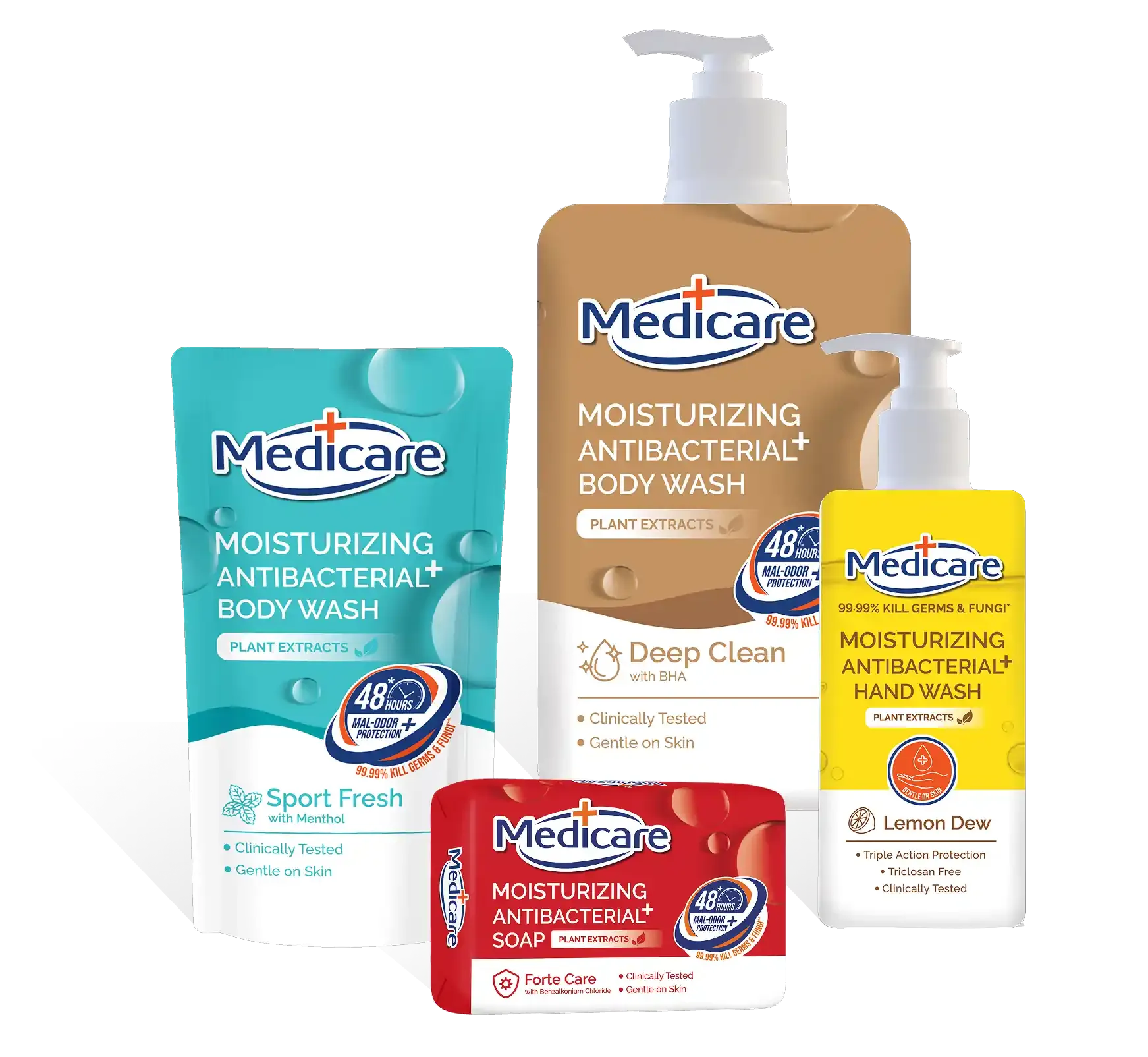
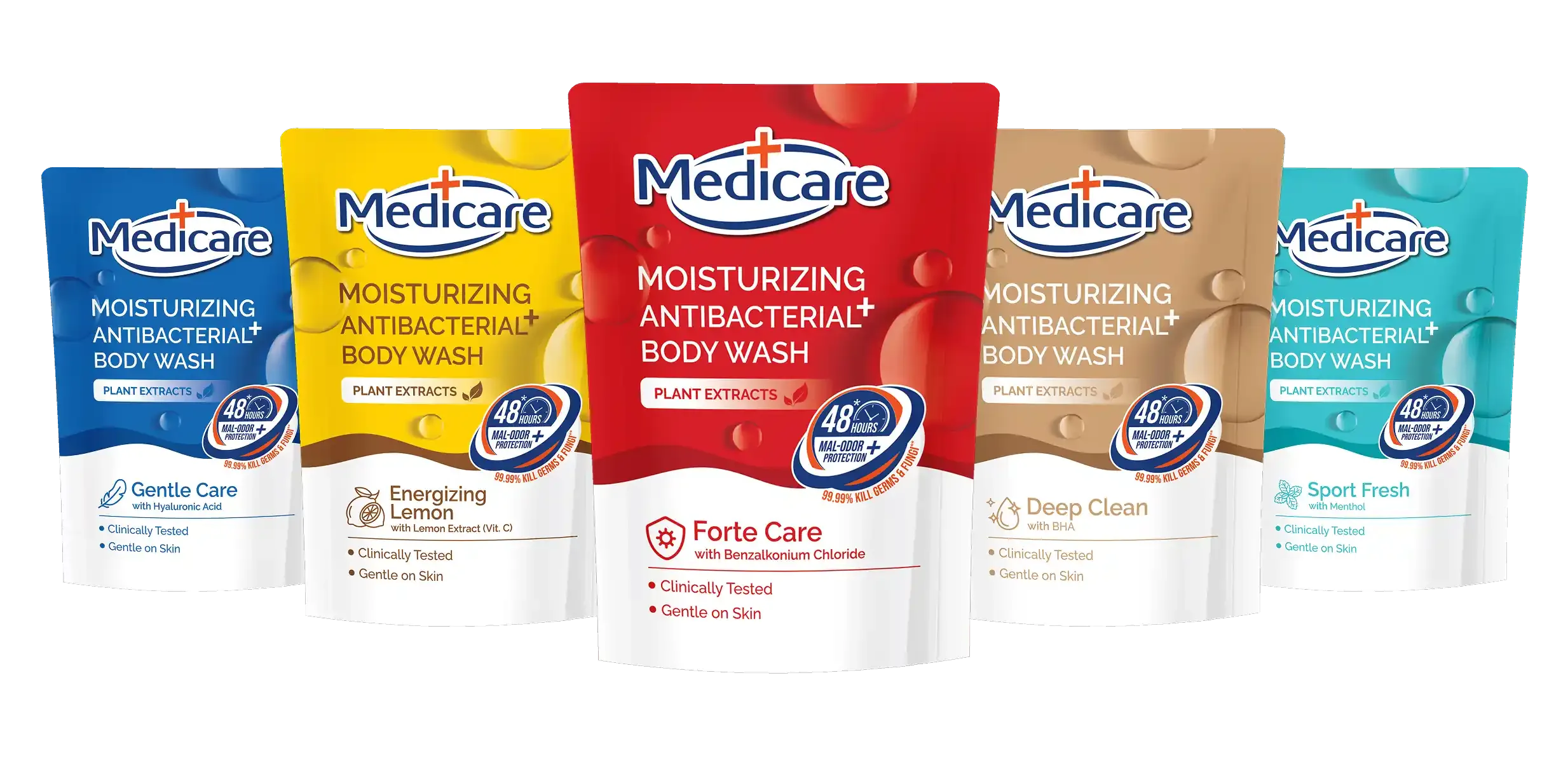
The new Medicare packaging was designed to look modern, clean, and premium.
- Be unisex and family-friendly.
- Highlight strong, relevant benefits: moisturizing, 99% germ and fungi protection, 48-hour odor control, clinically tested, and plant extracts.
- Use color-coded variants for easy product distinction.
- Deliver an emotional connection: trendy, aesthetic, and trustworthy, not just functional.
The new packaging:
- Elevated brand perception and trust.
- Aligned with modern consumer expectations.
- Removed the stigma of harsh antibacterial soaps.
- Made Medicare a top choice for its quality, not just its price.
