Lelap
Supplement to Relieve Sleep Disorders
As the market leader in the sleep aid category, Lelap has long been a trusted brand that helps relieve sleep disorders and improve rest quality.
Despite maintaining a strong market share, the brand now faces increasing competition from both local and imported players with more modern packaging and stronger visual identities.
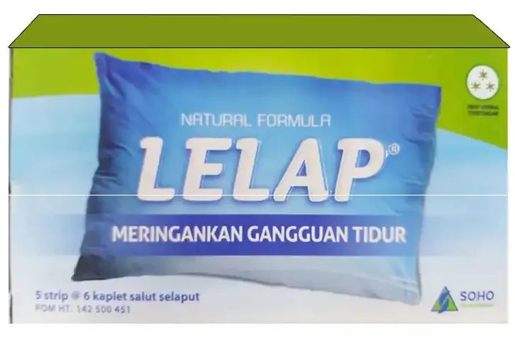
Lelap's signature light blue has been deeply associated with its brand recognition, yet visually it differs from the darker, night mode tones now common in the sleep aid segment. The challenge was to refresh Lelap's packaging, making it feel more modern and relevant while preserving the brand's iconic identity that consumers already know and trust.
Initial Design Direction
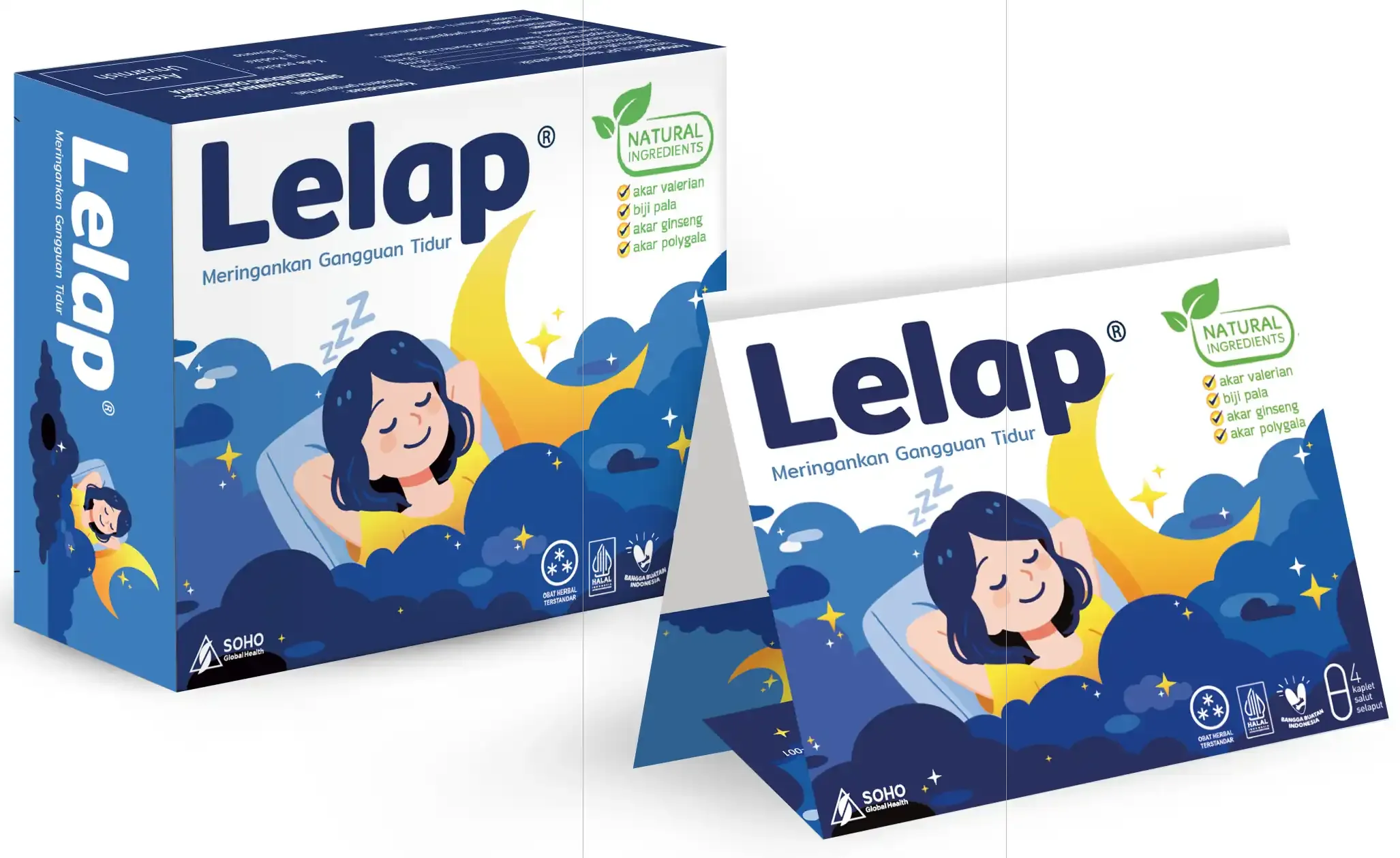
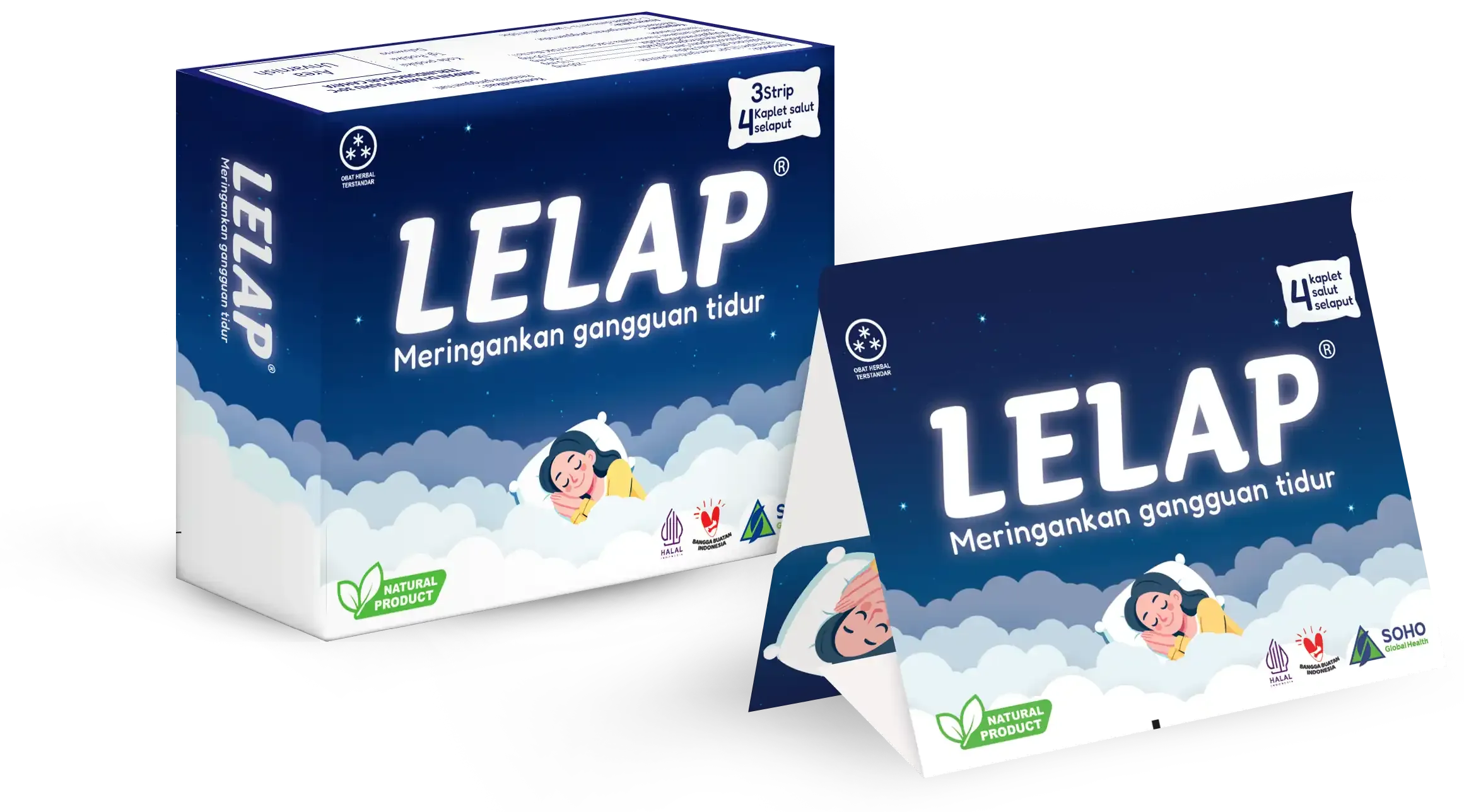
In the early exploration, we considered adopting a darker palette to capture the calm and serene feeling of nighttime, aligning with how many sleep-aid brands visually represent restfulness.
However, the client decided to retain Lelap's iconic light blue as the main brand color to maintain strong recall and identity. From there, the direction shifted to finding balance: introducing deeper, night-inspired tones while preserving Lelap's bright and familiar visual character.
Our objective was to evolve Lelap's design to stay relevant without losing its core essence.
The design needed to:
- Modernize the brand's visual identity to align with current trends.
- Retain Lelap's signature light blue while introducing deeper, night-inspired hues.
- Strengthen emotional connection through friendly and relatable visuals.
- Clearly communicate the natural ingredients and functional benefits.

Our Solution
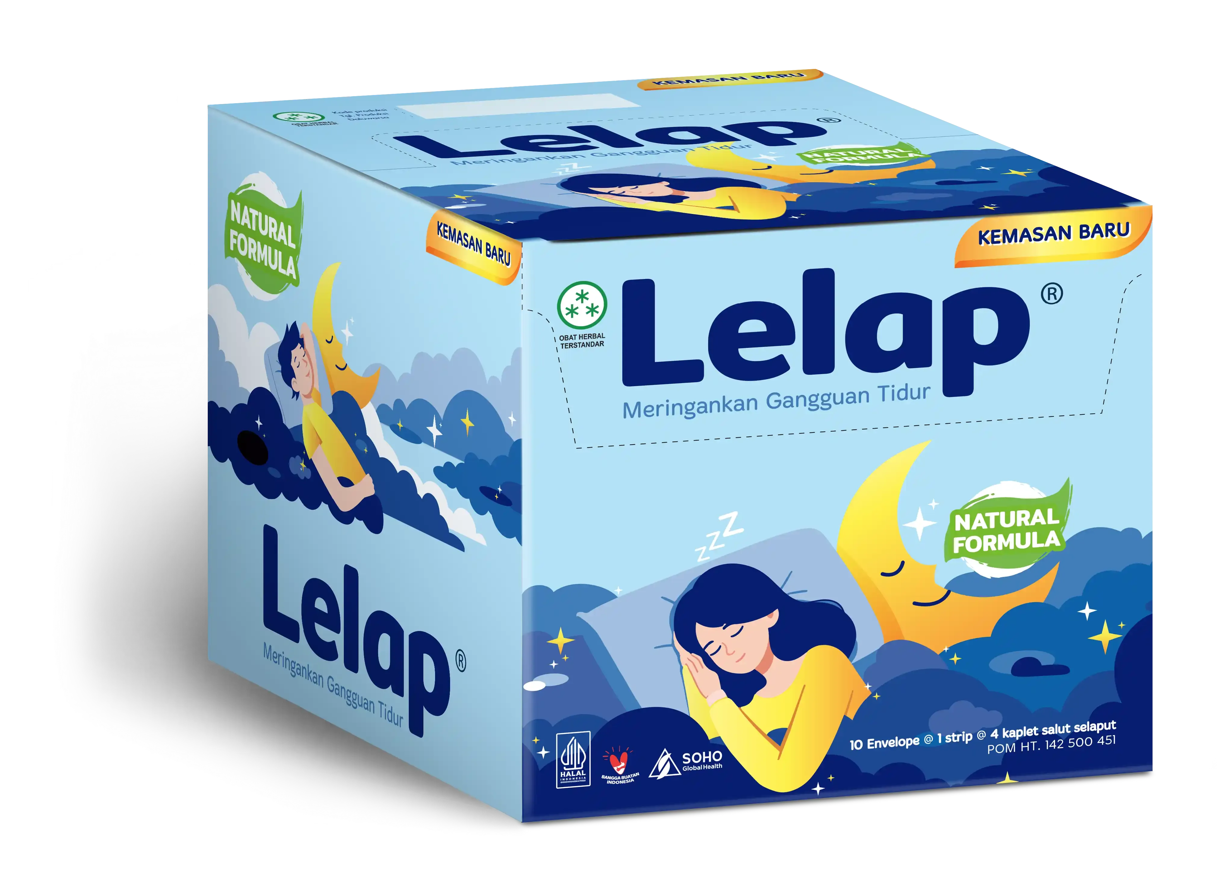
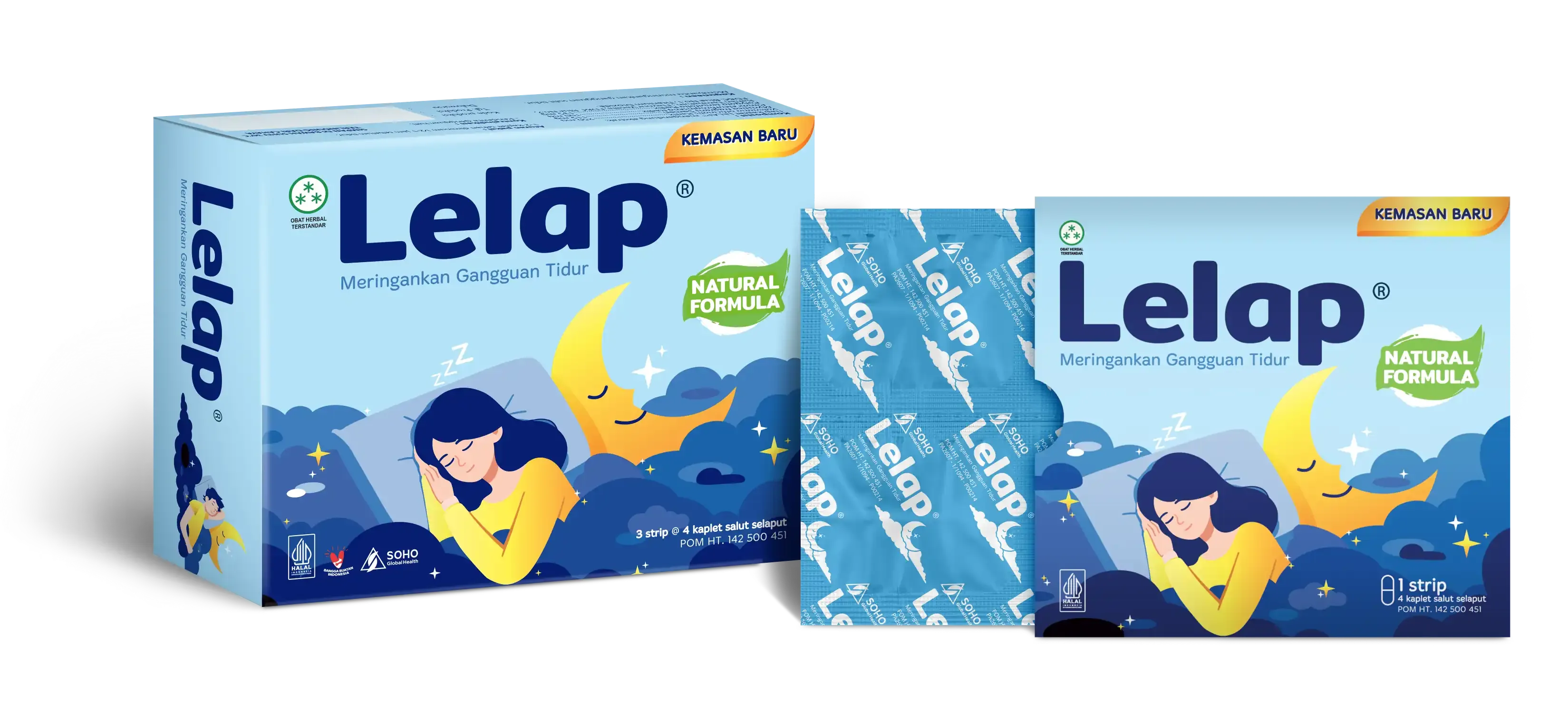
We introduced a new packaging system and refreshed logo identity that bring warmth and approachability to the brand:
- A rounded, bold logotype conveys a sense of calmness and comfort. Illustrative visuals of peaceful sleep replace outdated photo elements, creating a more timeless and human touch.
- Cloud elements were added to symbolize comfort and the feeling of light, deep sleep, reinforcing the idea of restfulness and serenity.
- The color palette balances Lelap's iconic light blue with deeper blues and soft yellow accents, bridging heritage and modernity.
- A clear information hierarchy and natural ingredient cues ensure easy readability and quick understanding.
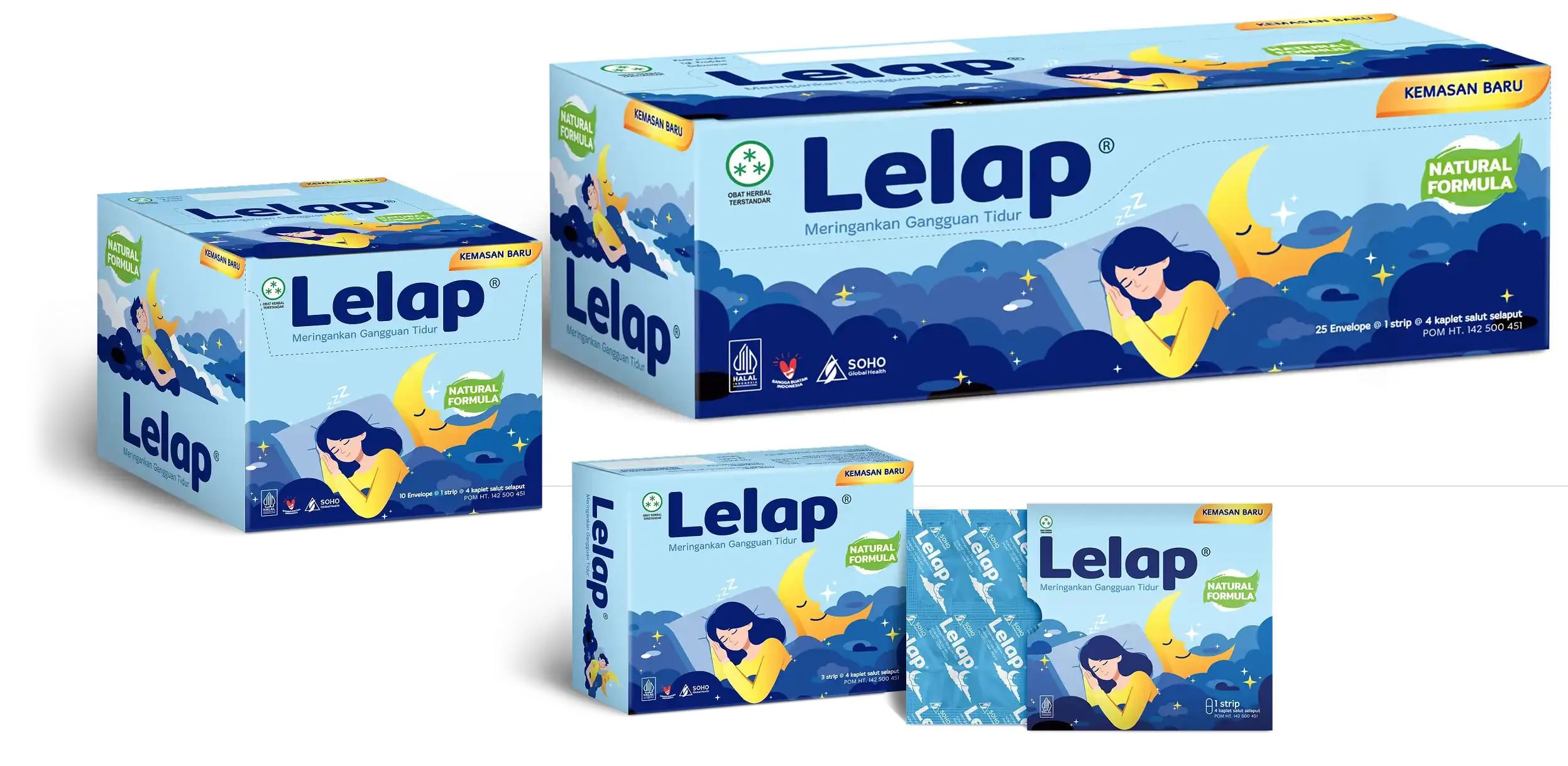

The new Lelap design successfully modernizes the brand while honoring its legacy, maintaining familiarity among loyal consumers while presenting a refreshed, inspiring, and contemporary look that strengthens Lelap's leadership in the sleep-aid category.

