Harmony
Soap Bar
A Fresh Look for
a Fruit Legend
Known as one of Indonesia's legendary fruit-inspired soap bars, Harmony has built its reputation on vibrant fragrances, refreshing formulas, and a cheerful identity that generations recognize. Loved for its playful spirit and memorable scents, Harmony remains a staple in the category, symbolizing freshness, joy, and everyday self-care.
Problem
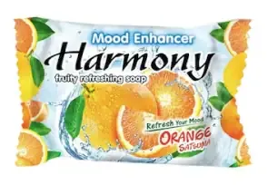
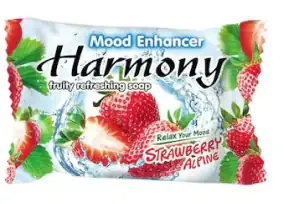
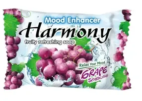
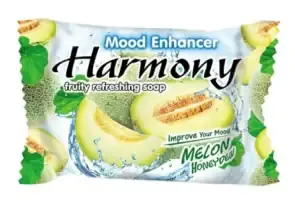
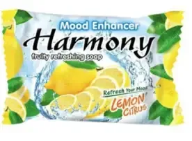
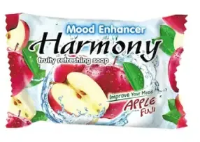
The primary challenge was to modernize the look and feel without
alienating loyal customers who are familiar with the
iconic packaging.
We needed to balance "familiarity"
with "freshness".
Our Solution
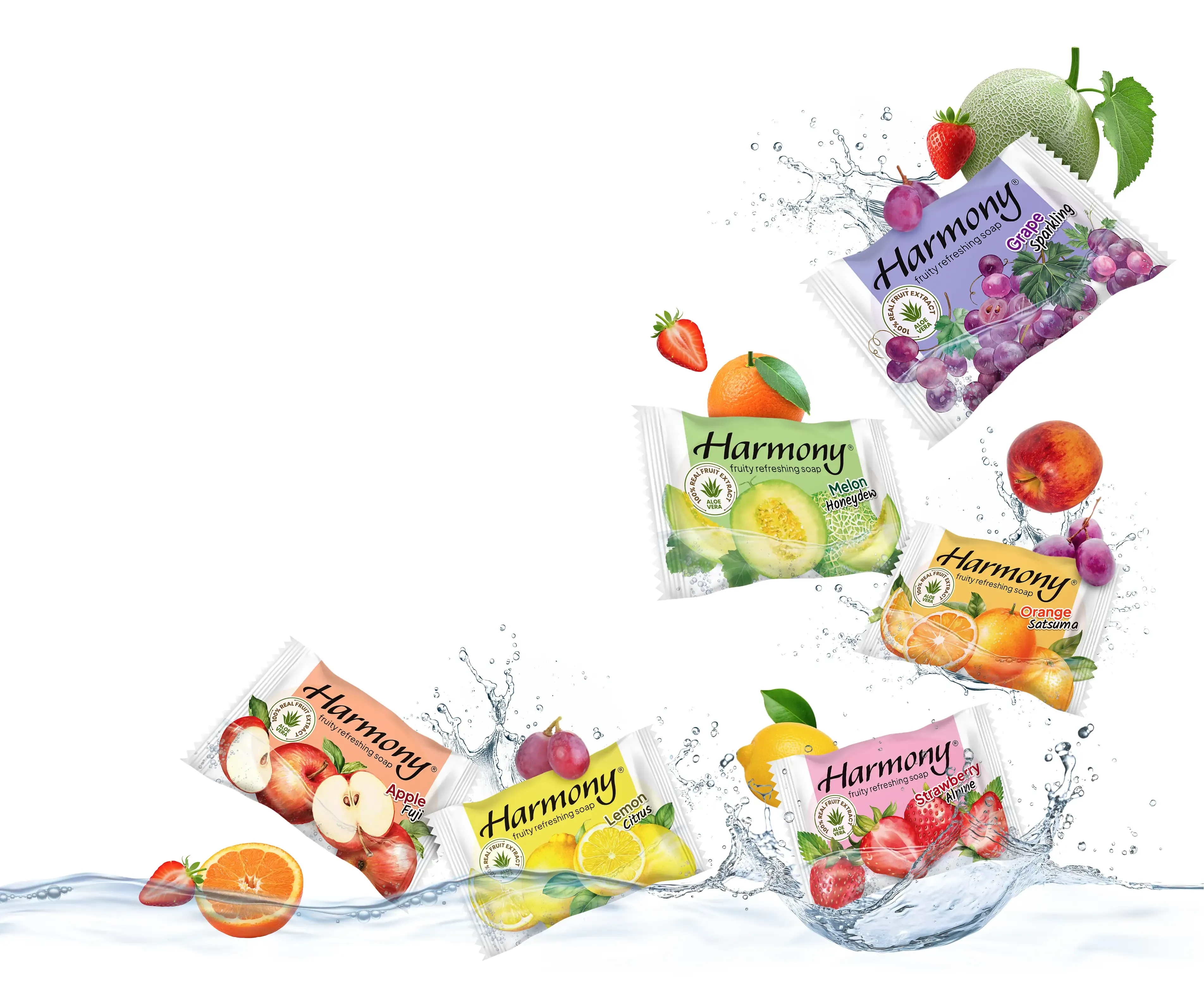
We adopted an “Evolution, not Revolution” approach. Instead of changing the brand's structure, we focused on upgrading the quality and style of the key visual assets.
Modernized Illustration: We replaced the dated imagery with high-definition, semi-realistic digital illustrations. The fruits were rendered to look more vibrant, dimensional, and "juicy" to maximize appetite appeal.
Dynamic Freshness: We enhanced the water splash effects and droplets, making them more dynamic and realistic to visually communicate the core benefit: "Fruity Refreshing Soap."
Refined Aesthetics: While maintaining the iconic color blocking and layout, we subtly polished the composition to create a cleaner, more contemporary look.
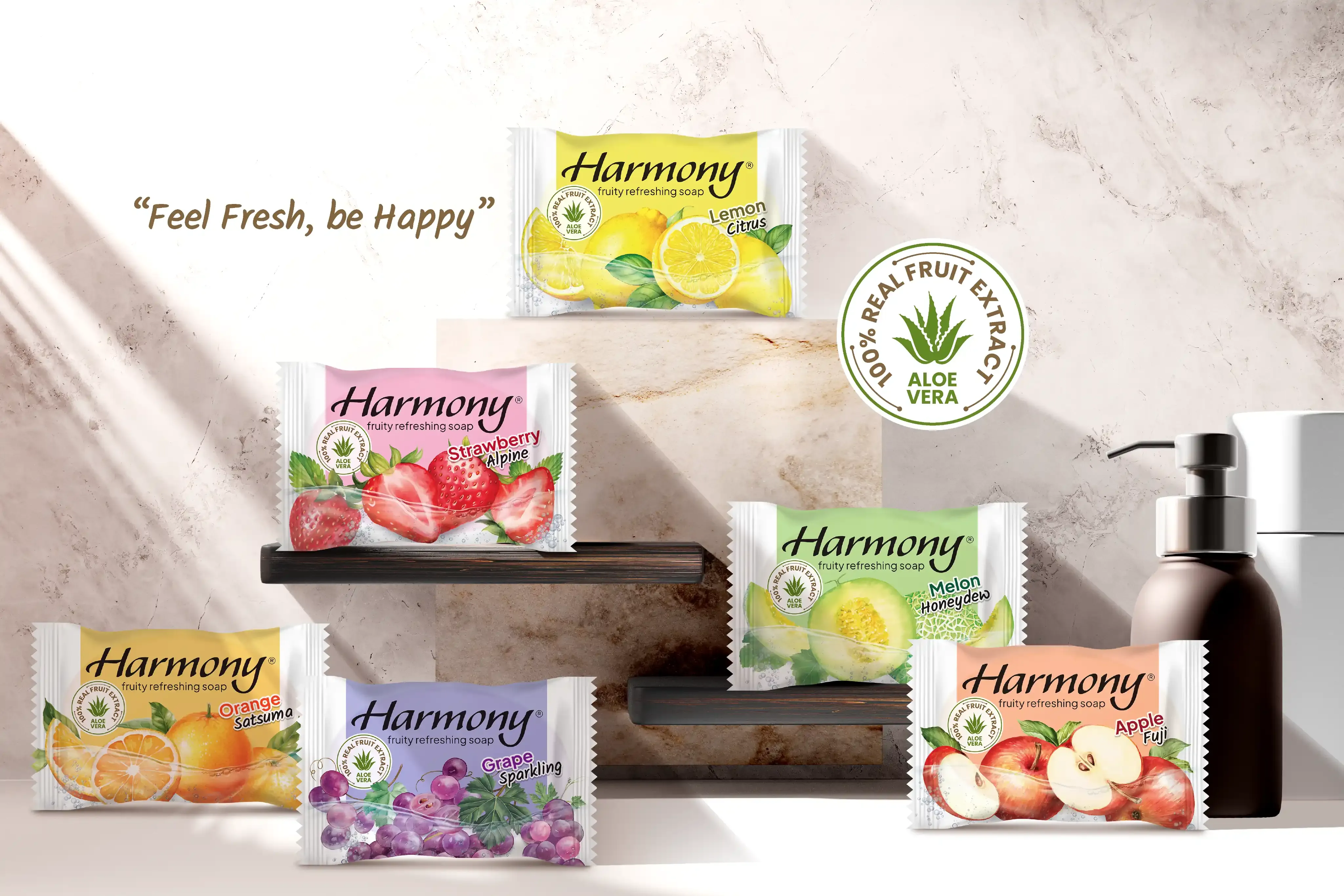
A revitalized packaging design that feels significantly fresher, premium, and modern, yet remains instantly recognizable as "Harmony" on the shelf.