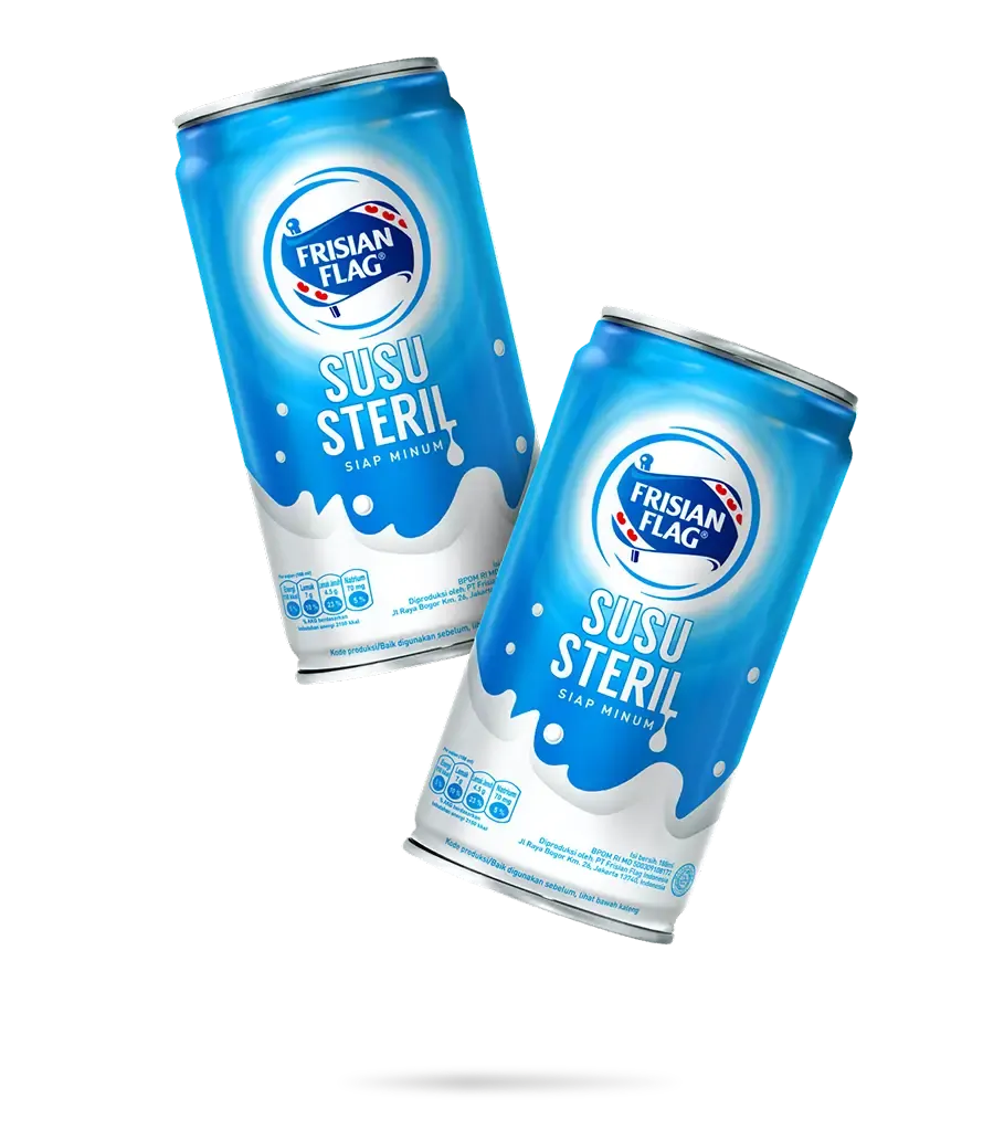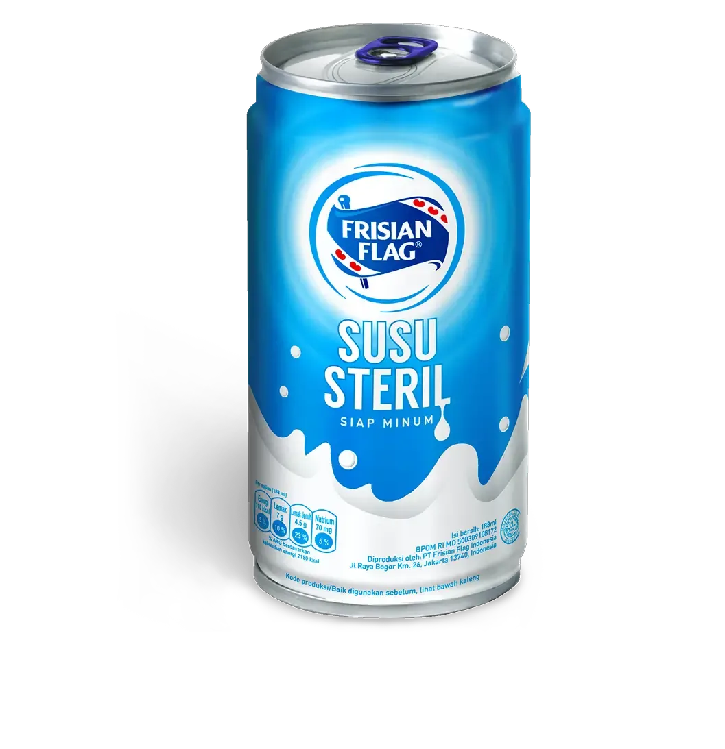
Frisian Flag Susu Steril
The Frisian Flag Susu Steril portfolio was designed to establish a competitive edge against Bear Brand Milk by emphasizing a distinctive and striking visual identity. Our approach centered on the simplicity of tonality to ensure the product stands out effectively on the shelf.
Color Palette
White and Cyan: We chose a minimalist color scheme of white and cyan to ensure clarity and prominence. The white splash highlights the milk's purity, while cyan background reinforce the Frisian Flag identity.
Brand Identity
Clear Presentation: The clean design showcases the Frisian Flag logo prominently, making the product easily identifiable and strengthening brand recognition.
Shelf Impact
Attention-Grabbing: The simplicity of the design ensures the product stands out on shelves, effectively catching consumers' eyes and differentiating it from Bear Brand Milk and other competitors.