
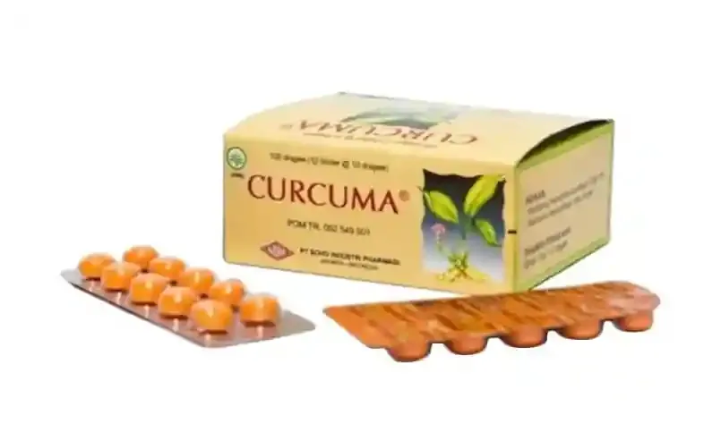
Curcuma Supplement For Liver
SOHO is a company renowned for its natural and traditional herbal medicine. While its products are widely trusted as effective supplements, they are sometimes perceived as less potent for treating specific illnesses or symptoms compared to modern medicine.
To address this perception and enhance the efficacy of its rejuvenation packaging, it is crucial to update the design to reflect a more modern and technological image. This shift in appearance will help position SOHO as a contemporary and trustworthy choice, bridging the gap between traditional herbal remedies and modern medical expectations.
Problem
Solution
.
We maintained consistency by using a similar tone and style for the logo of the variant extensions targeting medium and severe liver problems.
We incorporated colors to signify the severity levels and functions of the product, ensuring clarity and relevance.
To capture attention and engage consumers, we highlighted the key points of the product's USP with simple graphics, making them visually appealing and compelling.
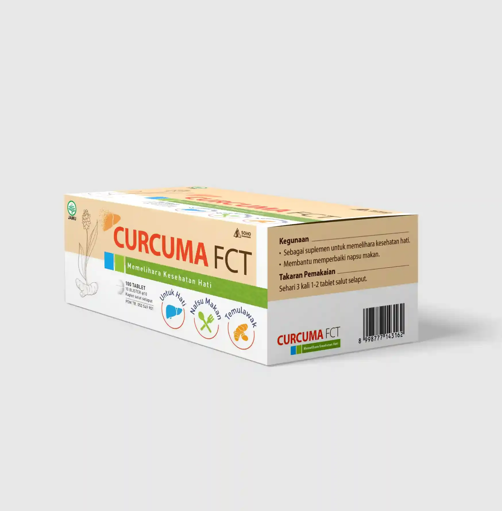
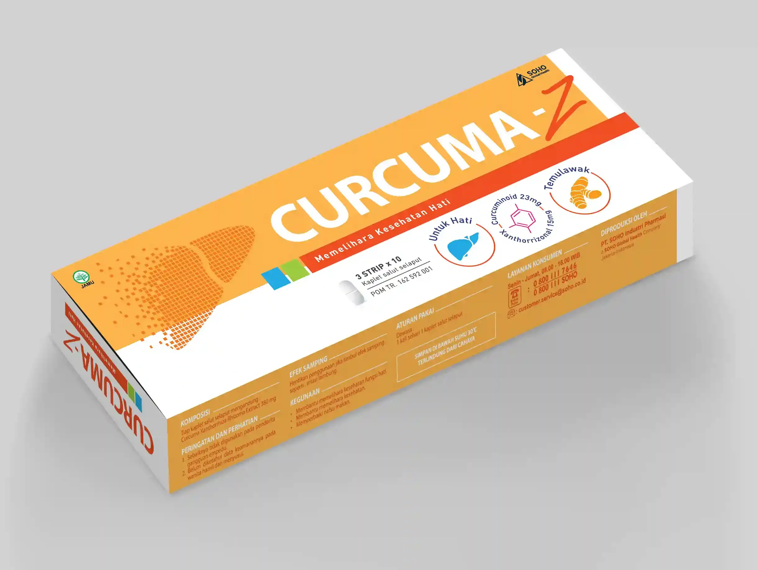
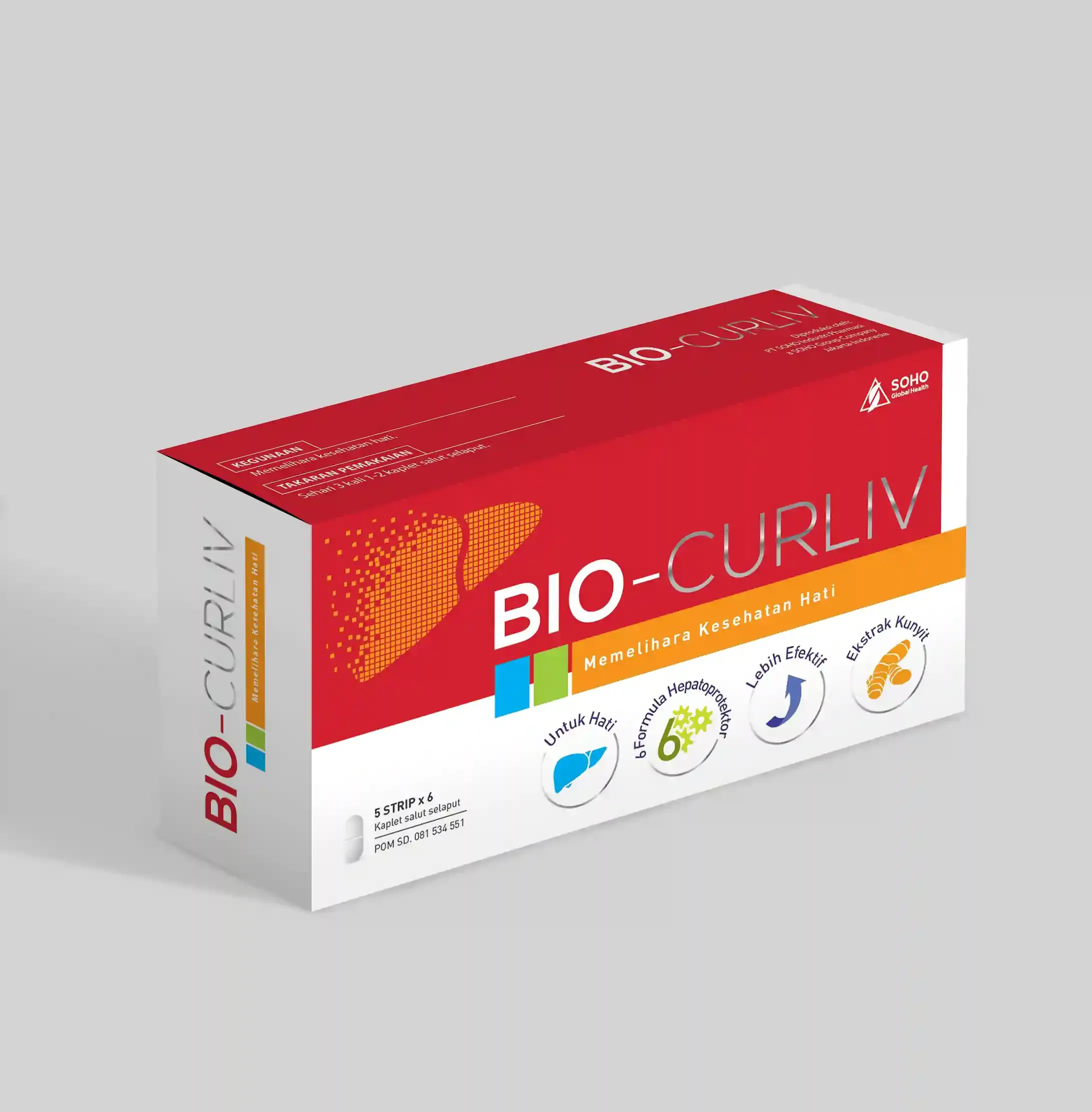
Our design approach embraced modernity, employing a layout that resonates with technology to enhance the perceived effectiveness of the product.
