CLIFT
For Men
Project Overview
In developing the packaging for CLIFT, we identified a key
challenge in the men's skincare market: many brands look
similar and lack a distinctive identity. CLIFT was created
to cut through the noise, targeting urban men in their 30s
who see self-care as essential to confidently navigating
their daily challenges.
Target Market Insight
Inspiring urban men today are:
- Sporty
- Aware that self-care is essential for confidence & self-worth
- Practical and no-fuss solutions, fast
- Resilience and assurance
- Successful
Design
Approach
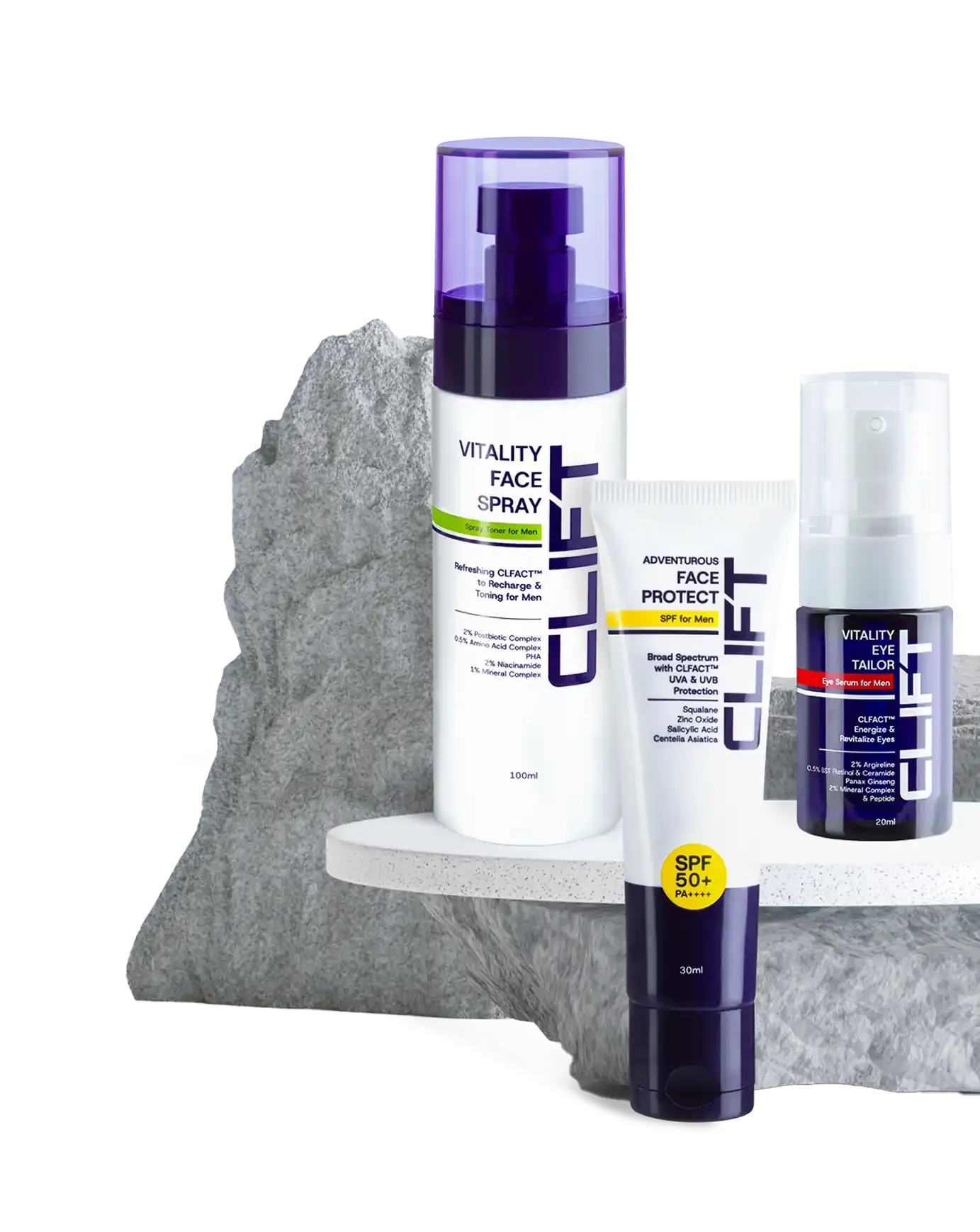
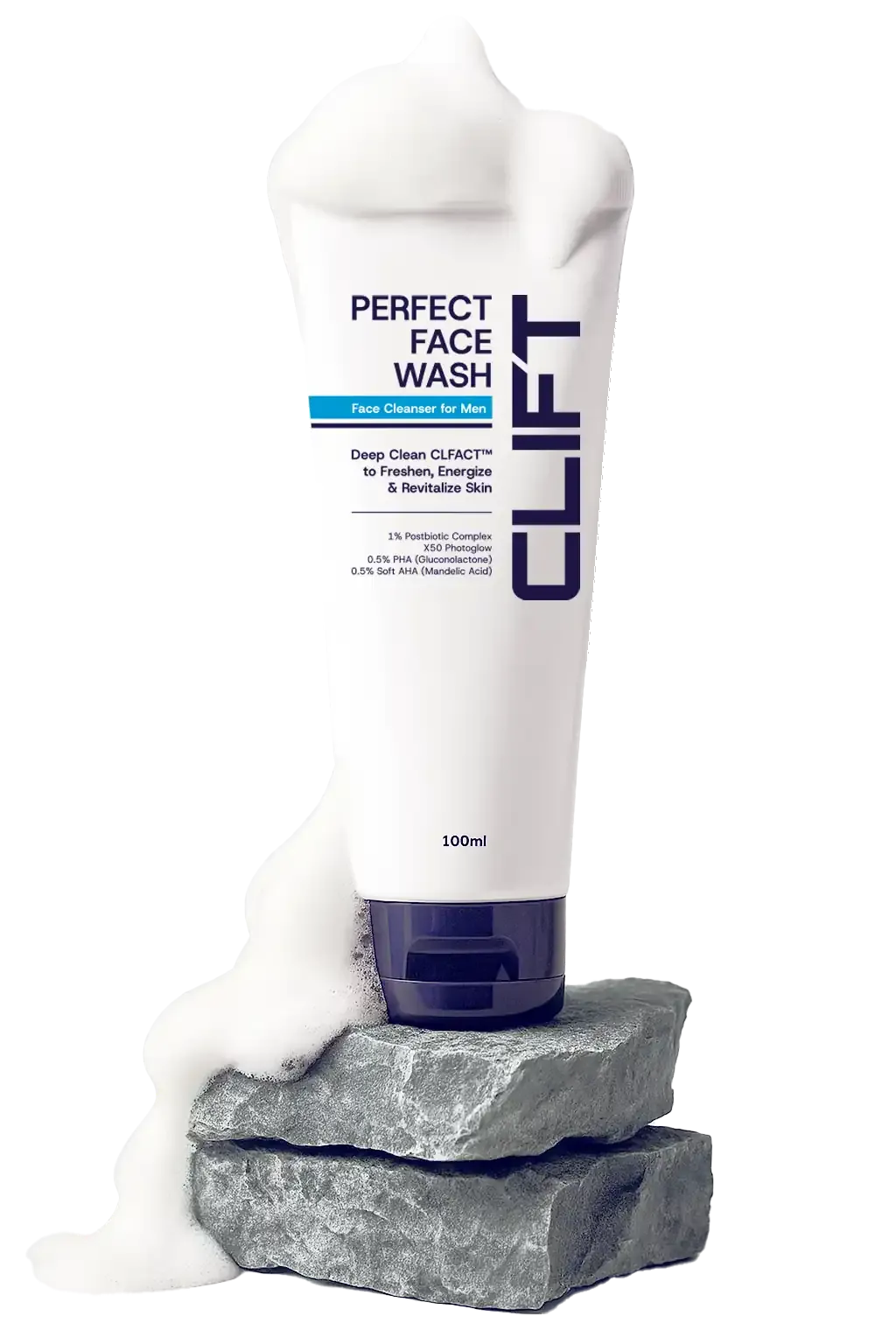
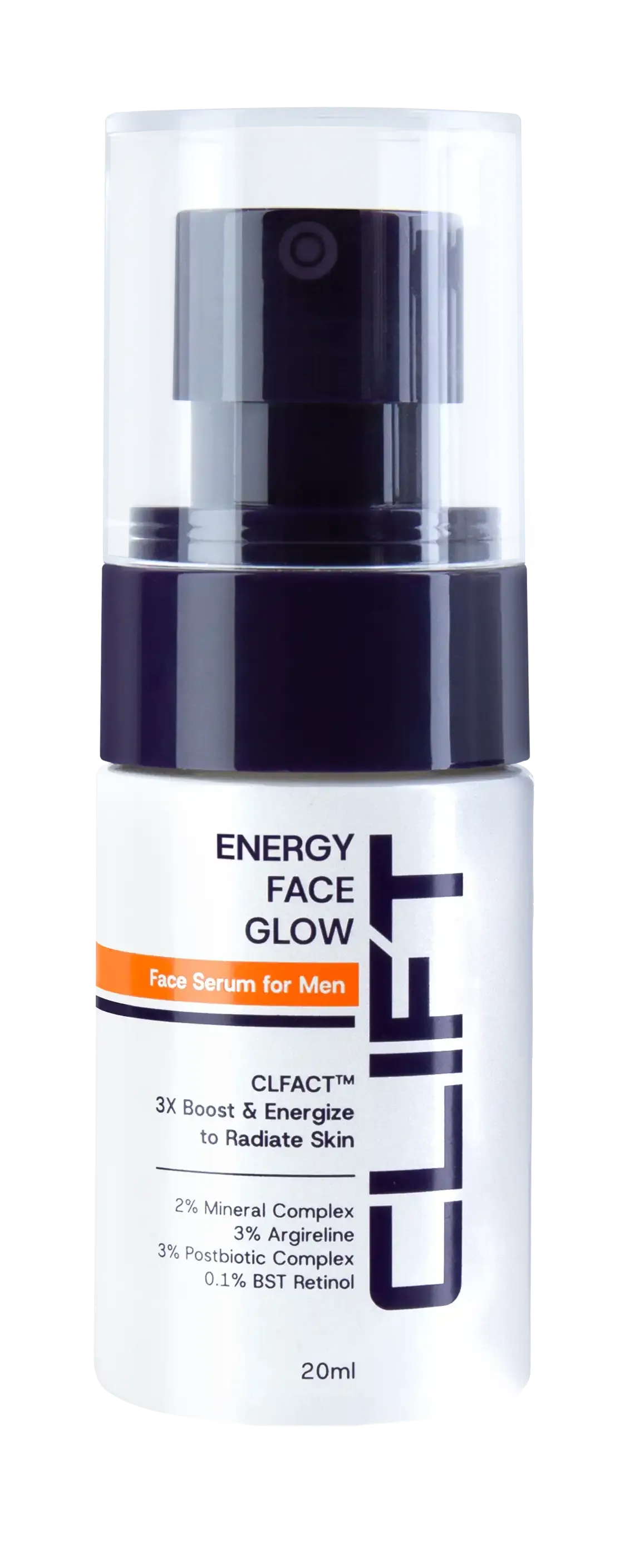
NAVY BLUE is the perfect color to represent "men".
We use two stripes along with the background color to differentiate one SKU from another. These stripes also symbolize speed.
The overall tone conveys a sense of masculinity, youth, sportiness, and success, perfectly aligned with the lifestyle of modern men who value efficiency and substance.
Face Wash
Toner
Face Serum
Eye Serum
Sunscreen
Overall
With CLIFT, we successfully created packaging that serves
not just as a product container, but as an extension of a
lifestyle that is simple, adventurous, and empowering.
