Packaging Design

Biokul Toppings falling down

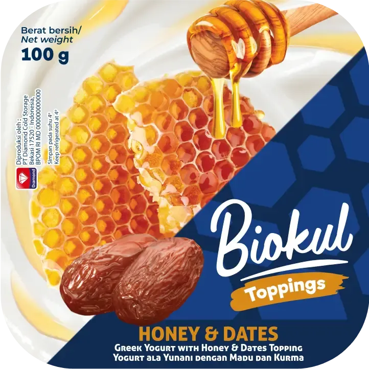
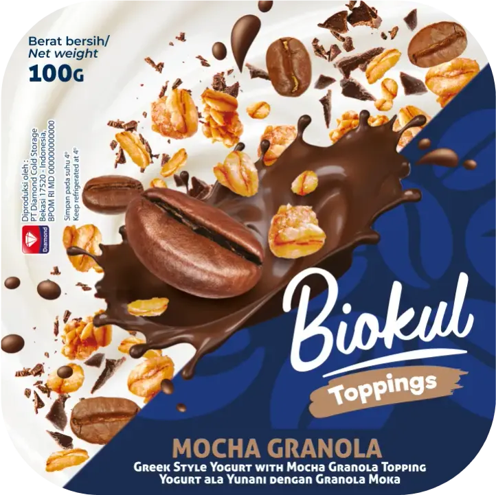
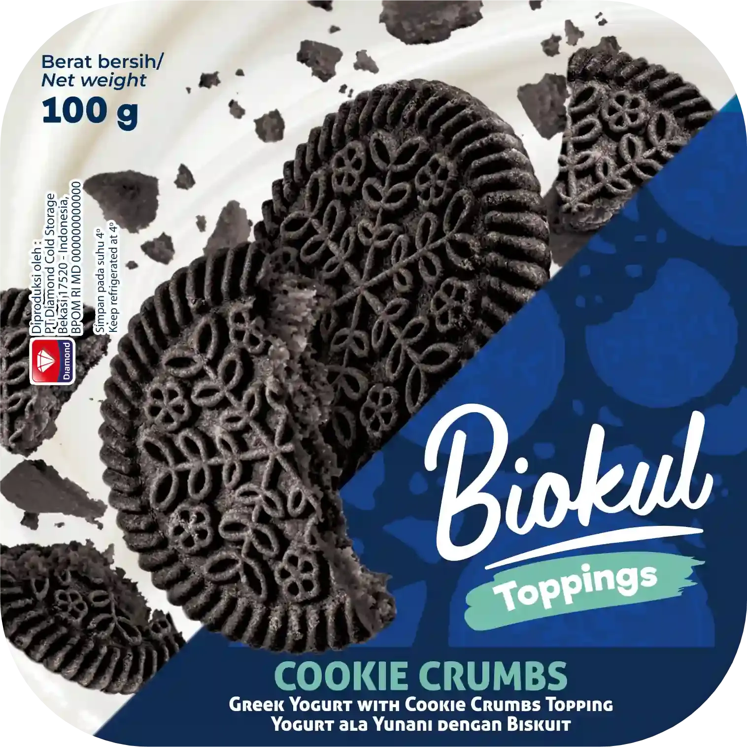
Biokul Toppings Biocompartment
Yoghurt

New Biokul Biocompartment yogurt packaging design for PT. Diamond Indonesia was launched in early 2024.

In the bio compartment category, the current leader is highly distinctive, setting a high standard that makes it challenging for Biokul to compete.

However, this also presents a significant opportunity for Biokul to stand out. By focusing on aspects such as competitive pricing, innovative layout, diverse flavors, and exploring new variants, Biokul can carve out a unique position in the market.

Biokul Toppings logo

Biokul Logo was provided, we completed the "Toppings" extension logo design as well as the whole packaging design.

Problem

Our main competitor's packaging is very clean and white, which sets a high standard in the market. Although Biokul's color code is dark blue, which contrasts sharply with the competitor's approach, it can appear too dark on the shelf.
Biokul Toppings Peach flavorBiokul Toppings Strawberry flavorBiokul Toppings Mango flavor
Biokul Toppings Mango flavorBiokul Toppings Mocha Granola flavor
Biokul Toppings Oreo flavor

Our Solution

To address this problem, we've opted for a bold design: A diagonal split of white and navy. This creates a distinctive and memorable shape that stands out. The white section also allows us to effectively showcase dimensions and create depth in the imagery, enhancing both the foreground and background elements.
Biokul Toppings all flavor photoshoot

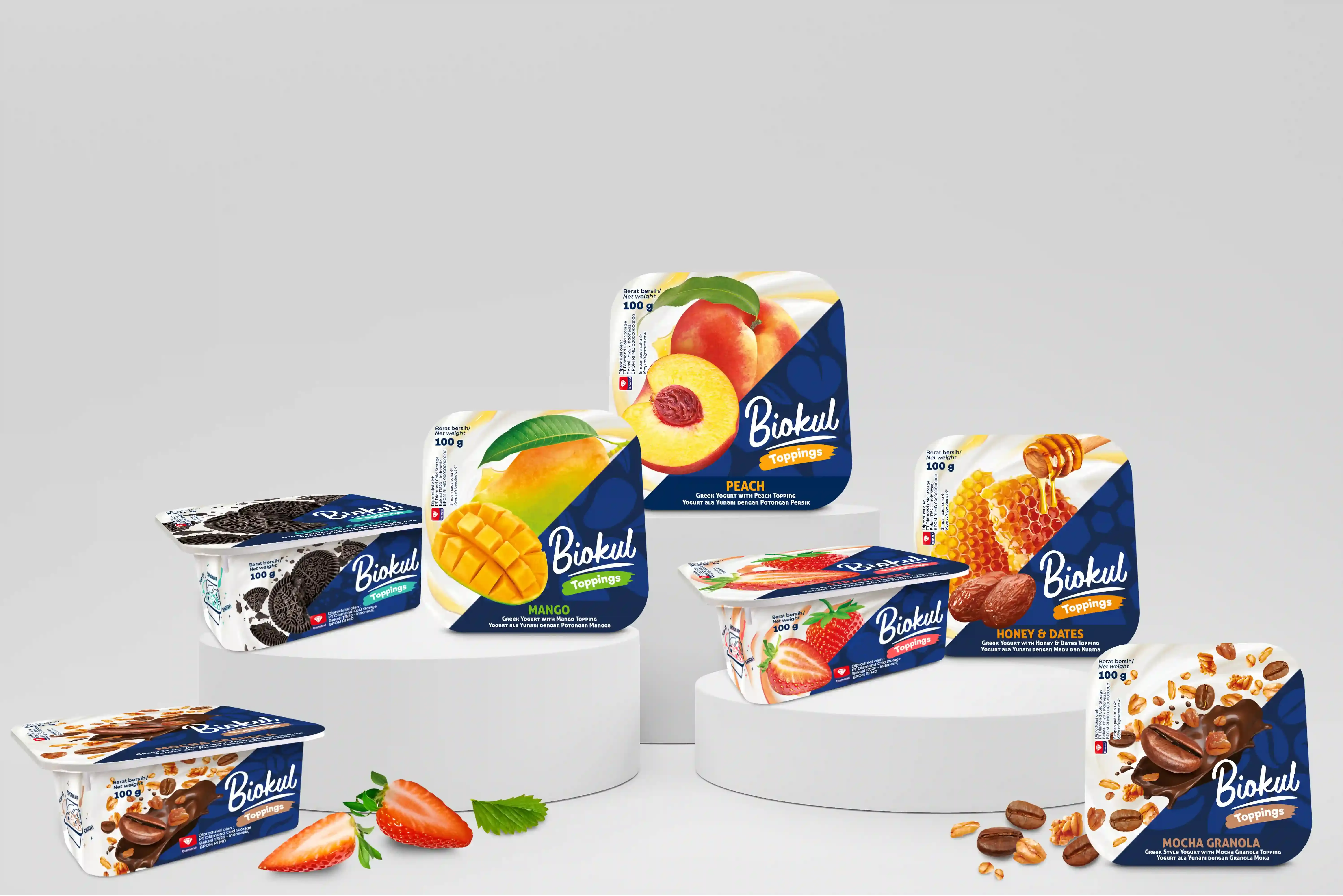
Distinctive appearance
on shelf

Biokul Toppings on display 1
Biokul Toppings on display 2

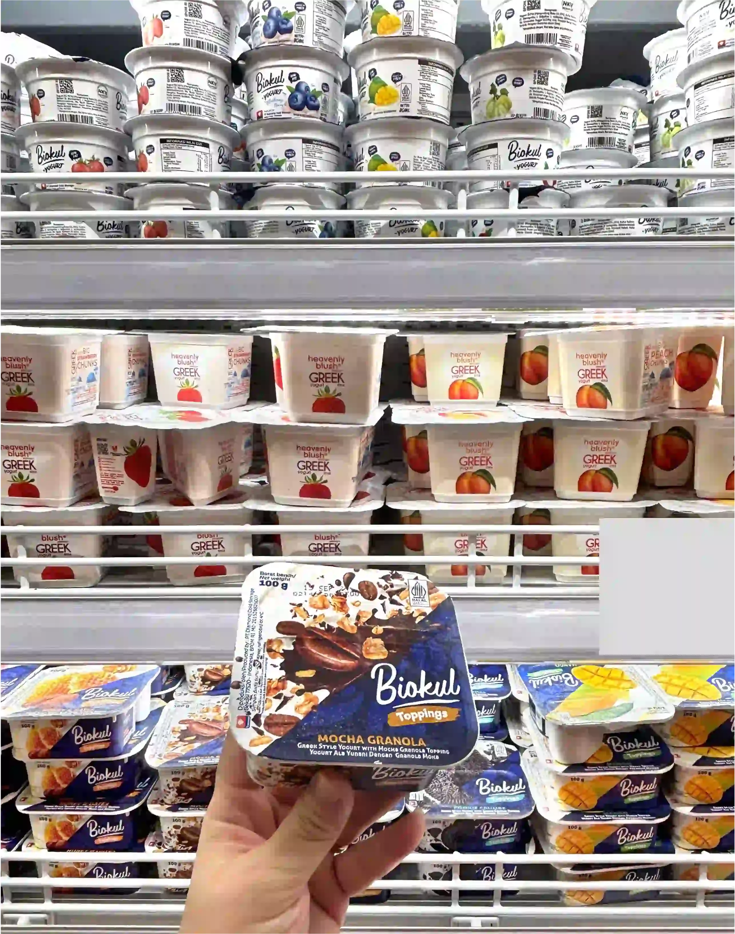
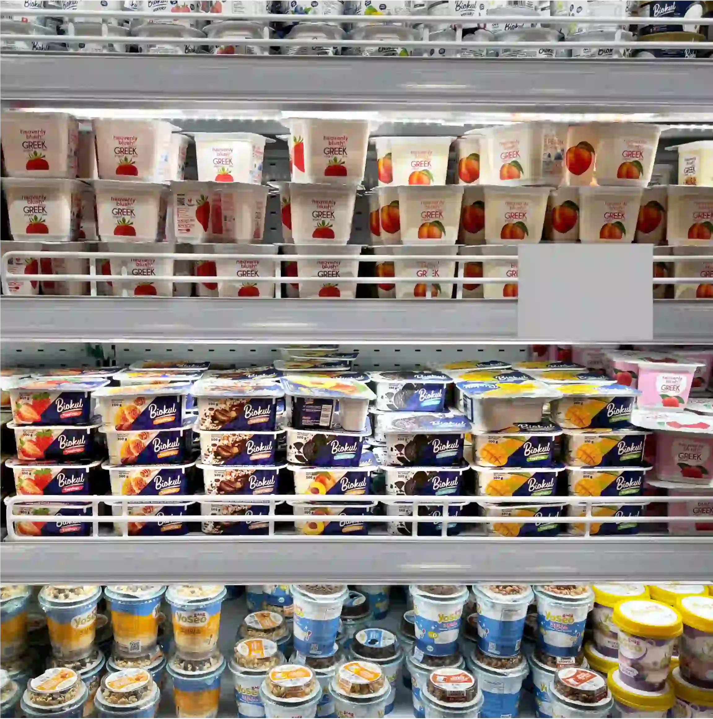
New Biokul biocompartment yoghurt packaging design successfully stand out from the crowd


Gazelle Design Agency Logo