Pyfa
Identity
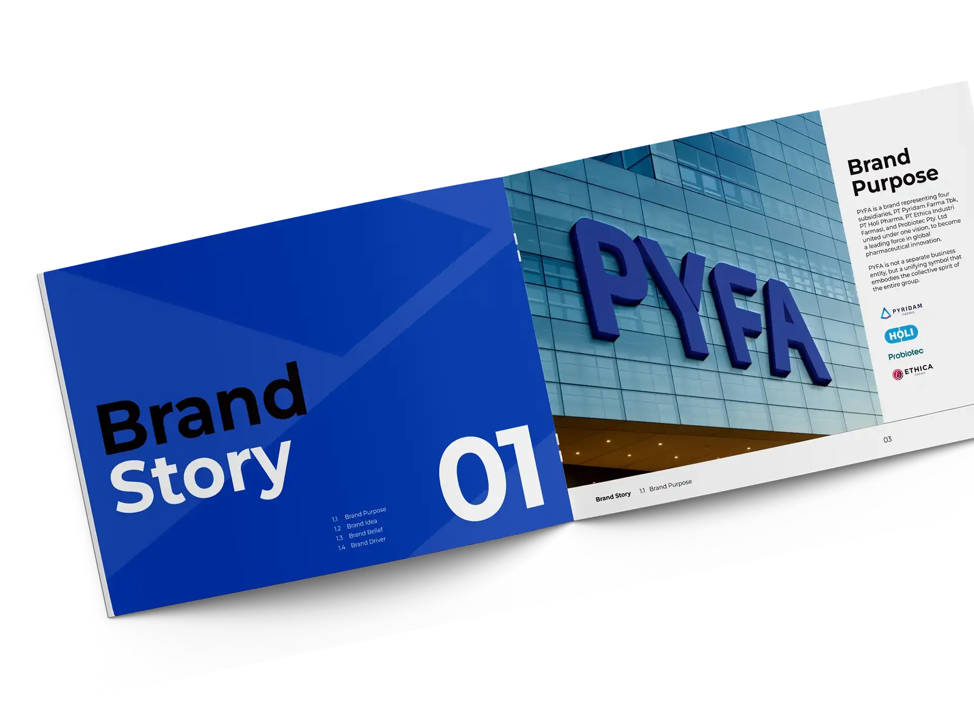
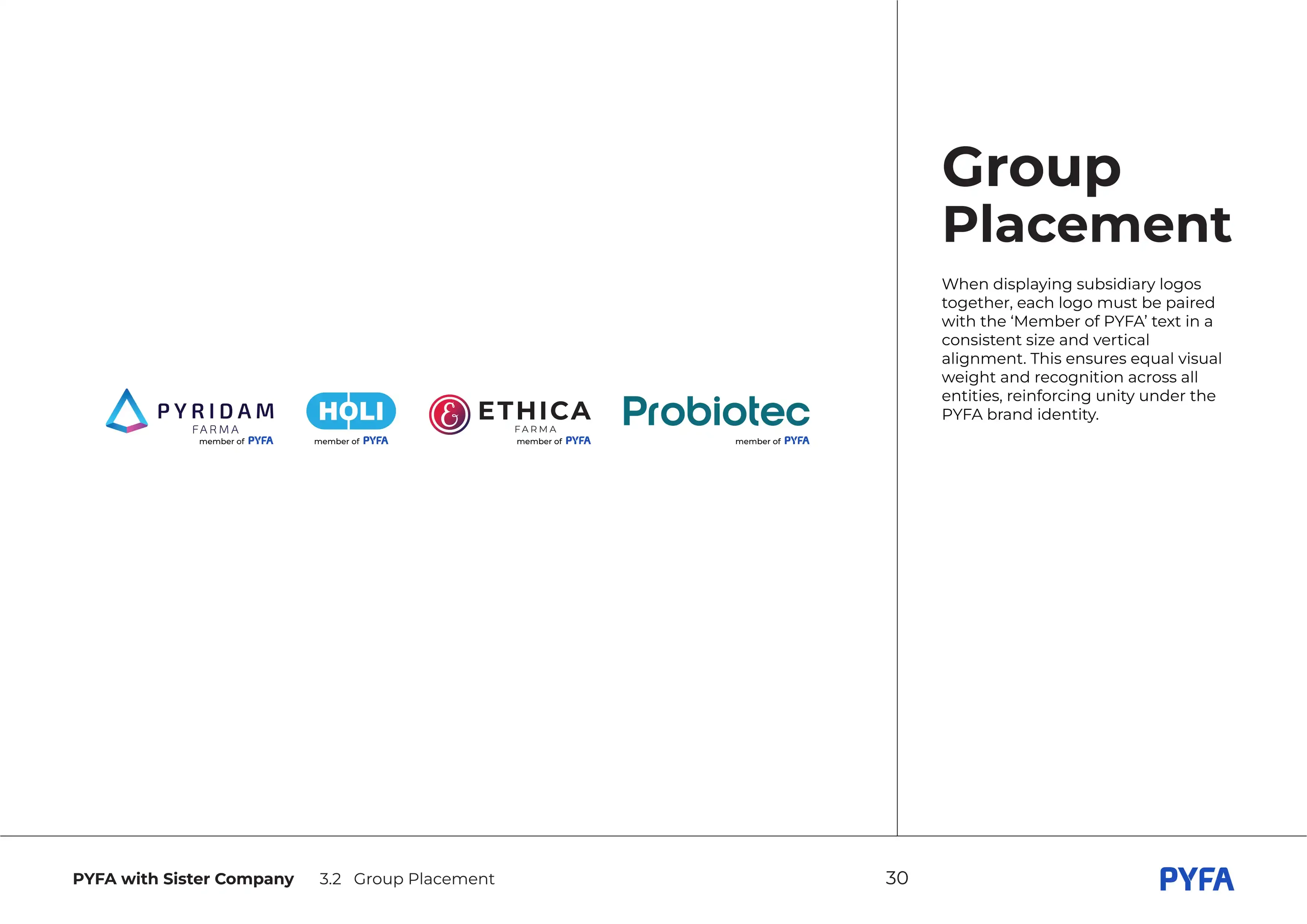
PYFA Group is a growing healthcare and pharmaceutical umbrella brand with multiple member companies and business units. As the Group expanded, the need for a unified and consistent corporate identity became increasingly essential.
We redesigned the logo to be simpler, cleaner, and more adaptable, setting a solid foundation for a stronger and more unified identity.
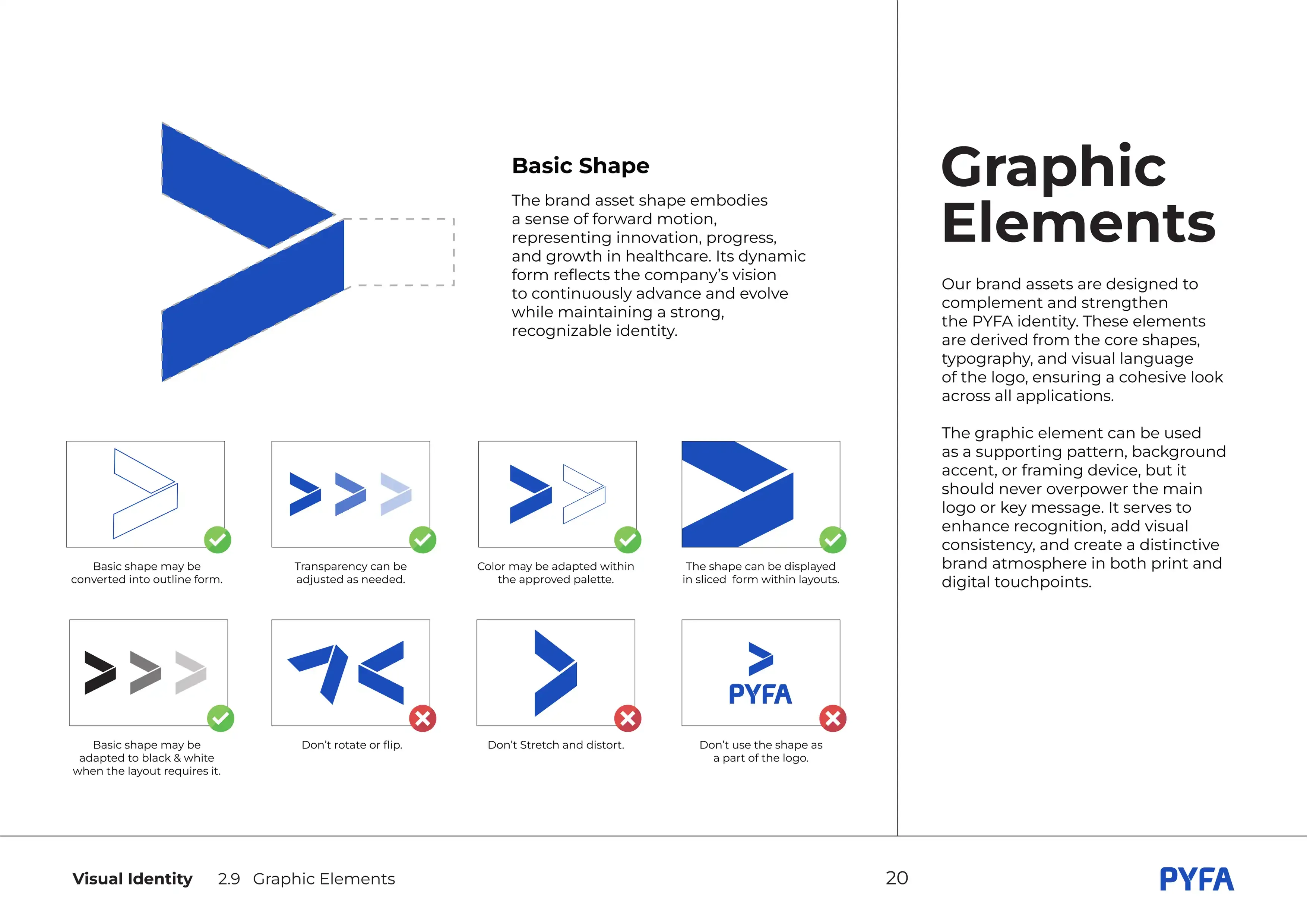
The PYFA logo combines rounded curves and sharp angles to express both approachability and precision. Rounded shapes convey a human, gentle touch, while clean cuts reflect high standards and technical reliability. Diagonal connections suggest progress and collaboration.
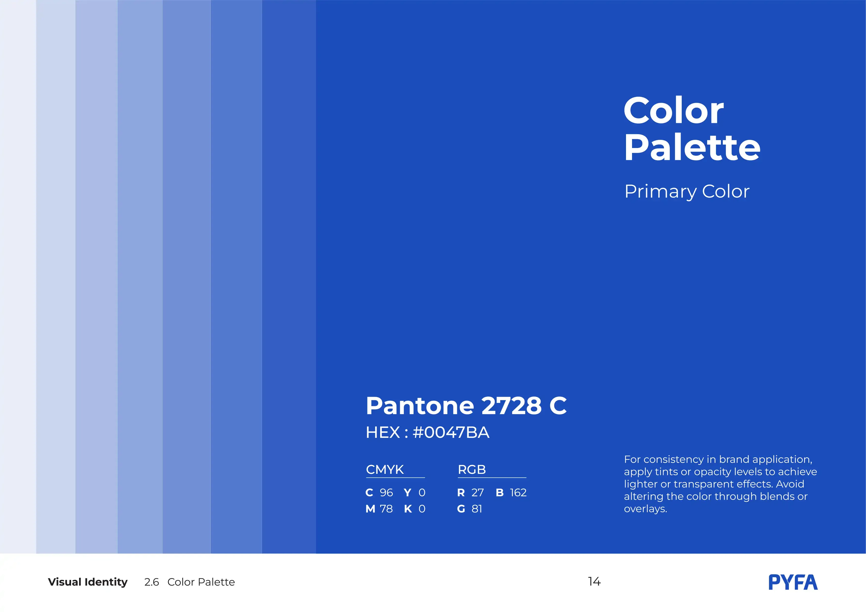
Its minimalist sans-serif form ensures clarity and professionalism across all uses. The color was chosen for its strong association with trust, safety, and stability, making it ideal for a healthcare and pharmaceutical brand.
Corporate
Brand Book
With the new logo in place, it became clear that PYFA Group needed proper guidelines to ensure consistent use across all member companies and business units. Since each one had been operating with its own visual style, the brand required a unified system to maintain coherence and support the Group's growing structure.
This led us to develop a complete corporate brand book that brings the entire organization together under one clear and consistent identity.
Brand
Story
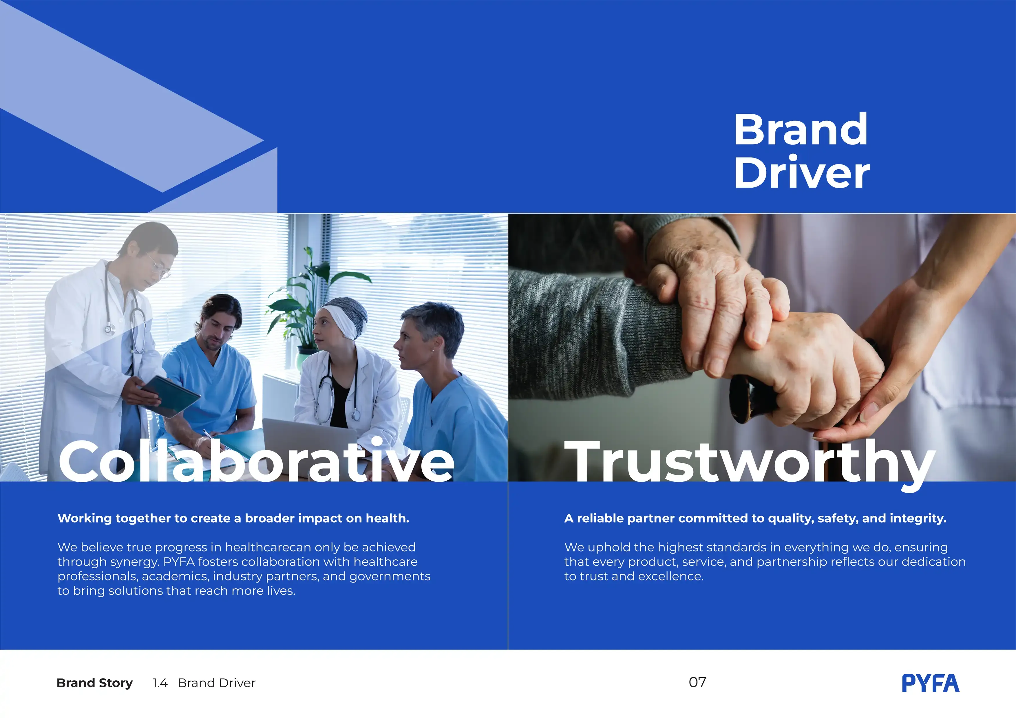
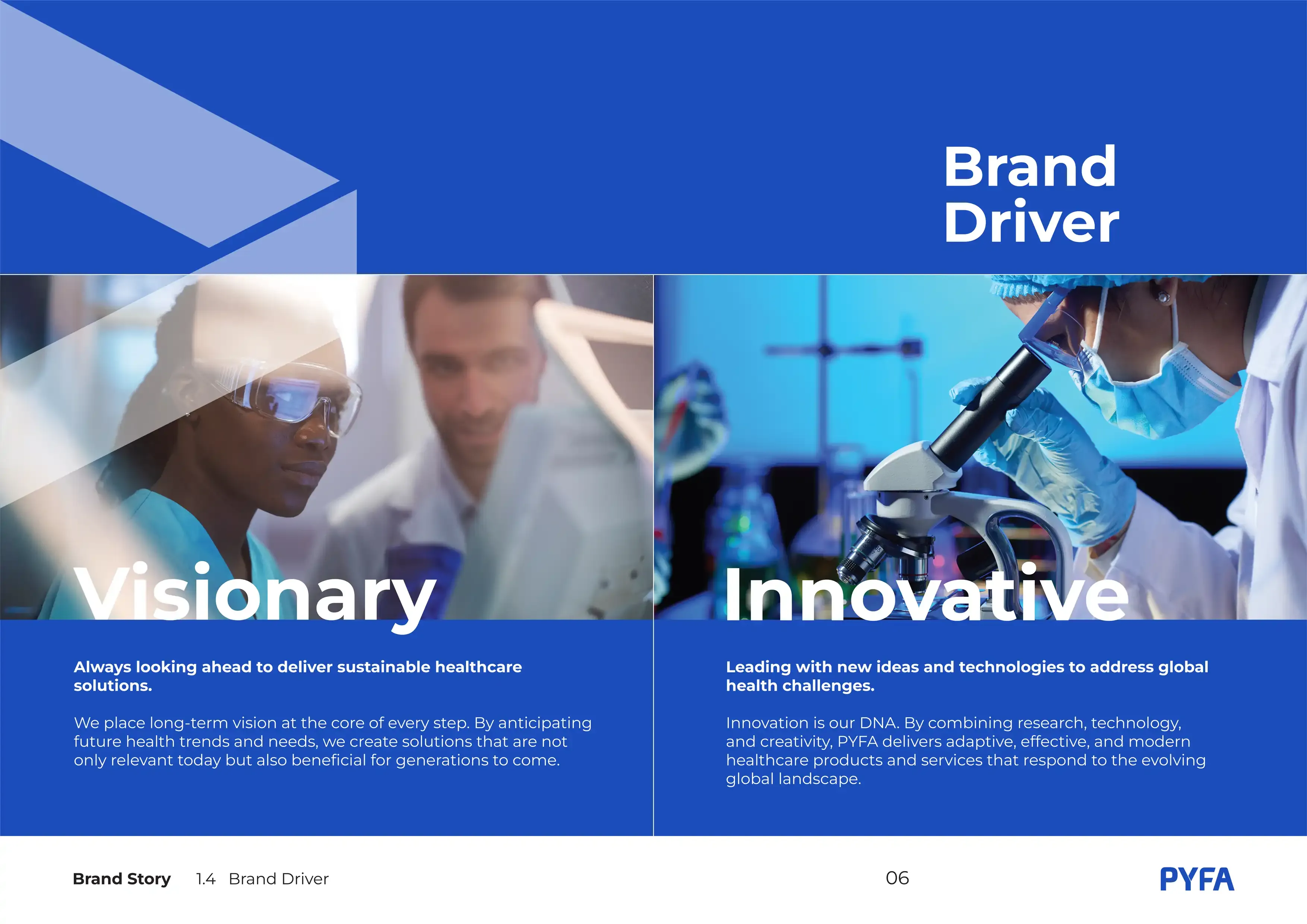
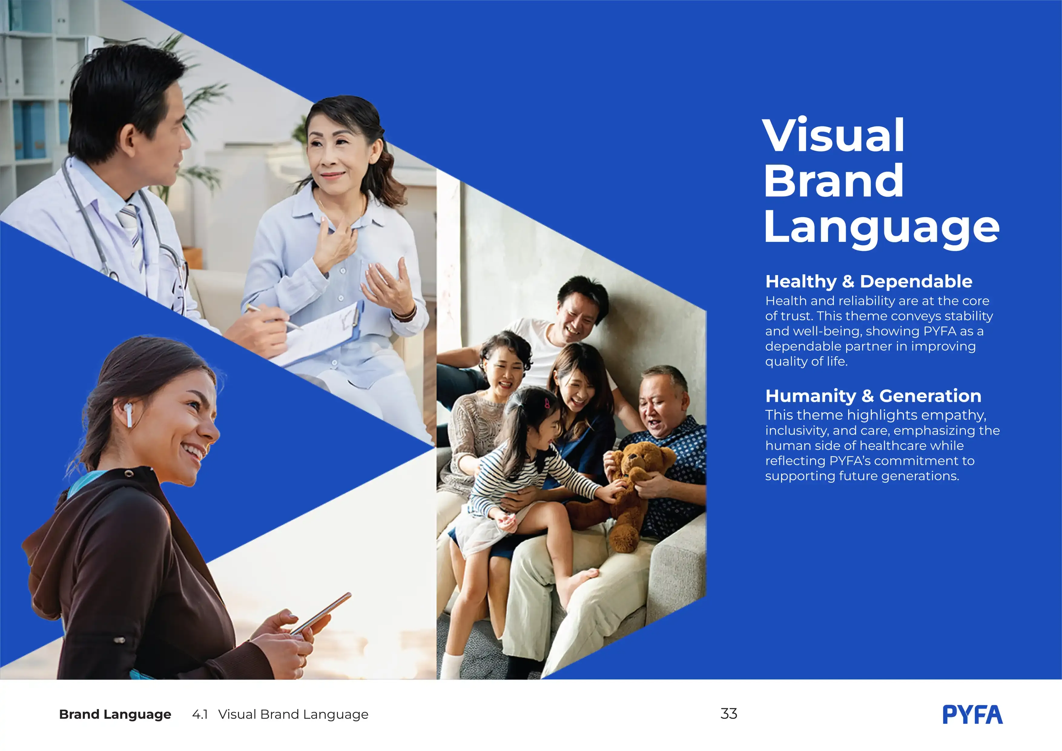
A complete identity system built for clarity, consistency, and long-term scalability. This chapter outlines how PYFA Group presents itself across all media:
Visual
Identity
Pyfa with
Sister Company


Brand
Language

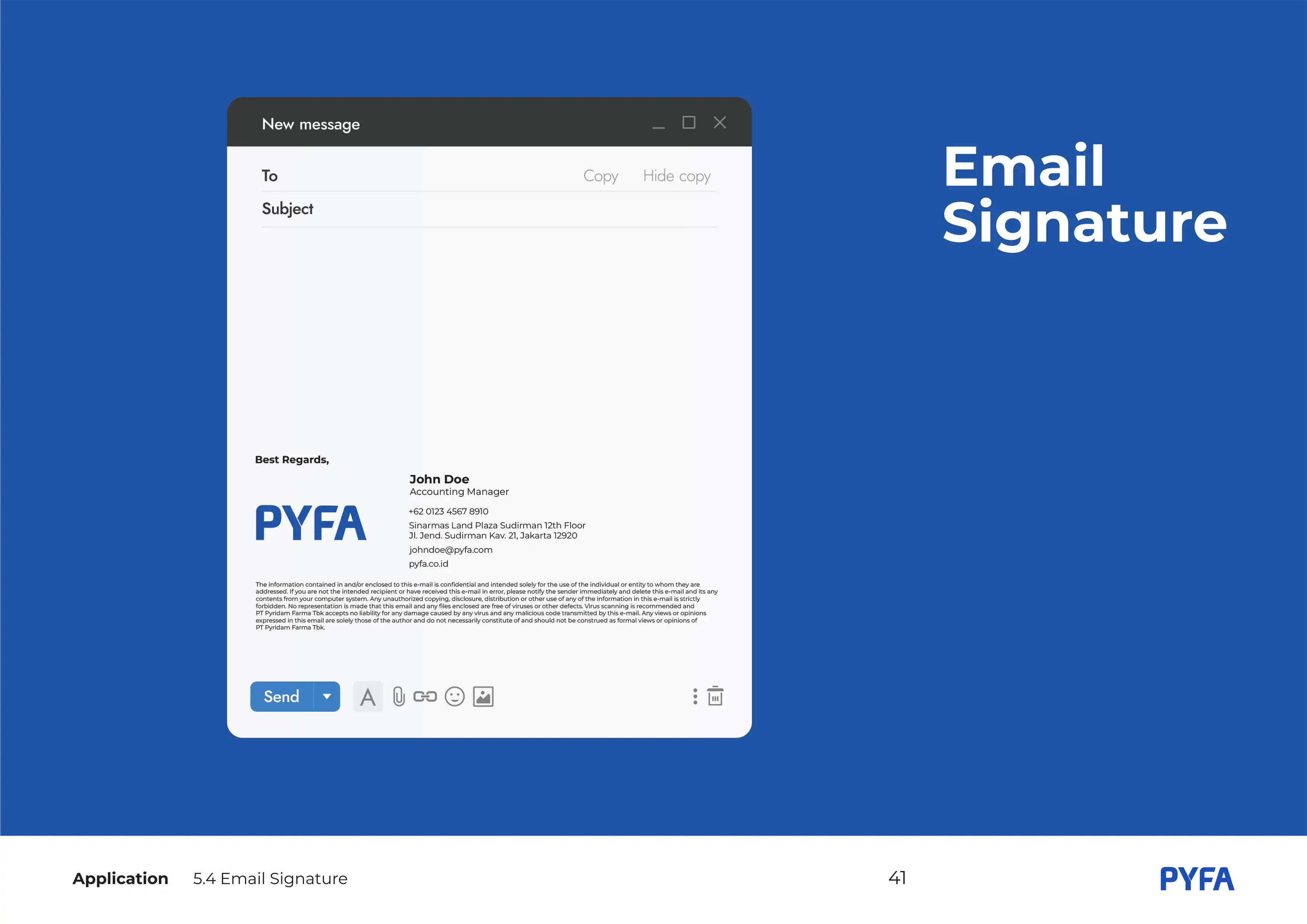
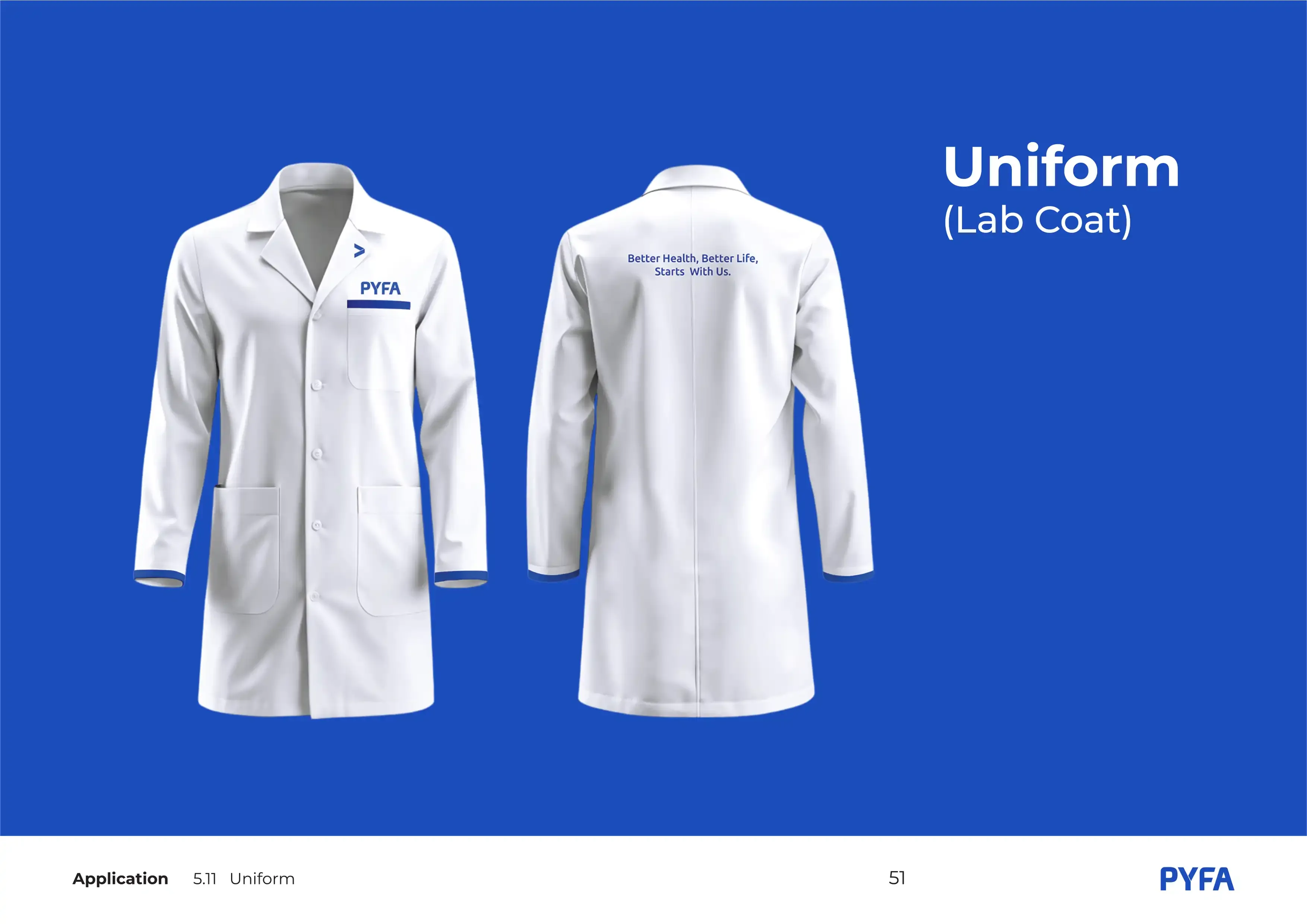
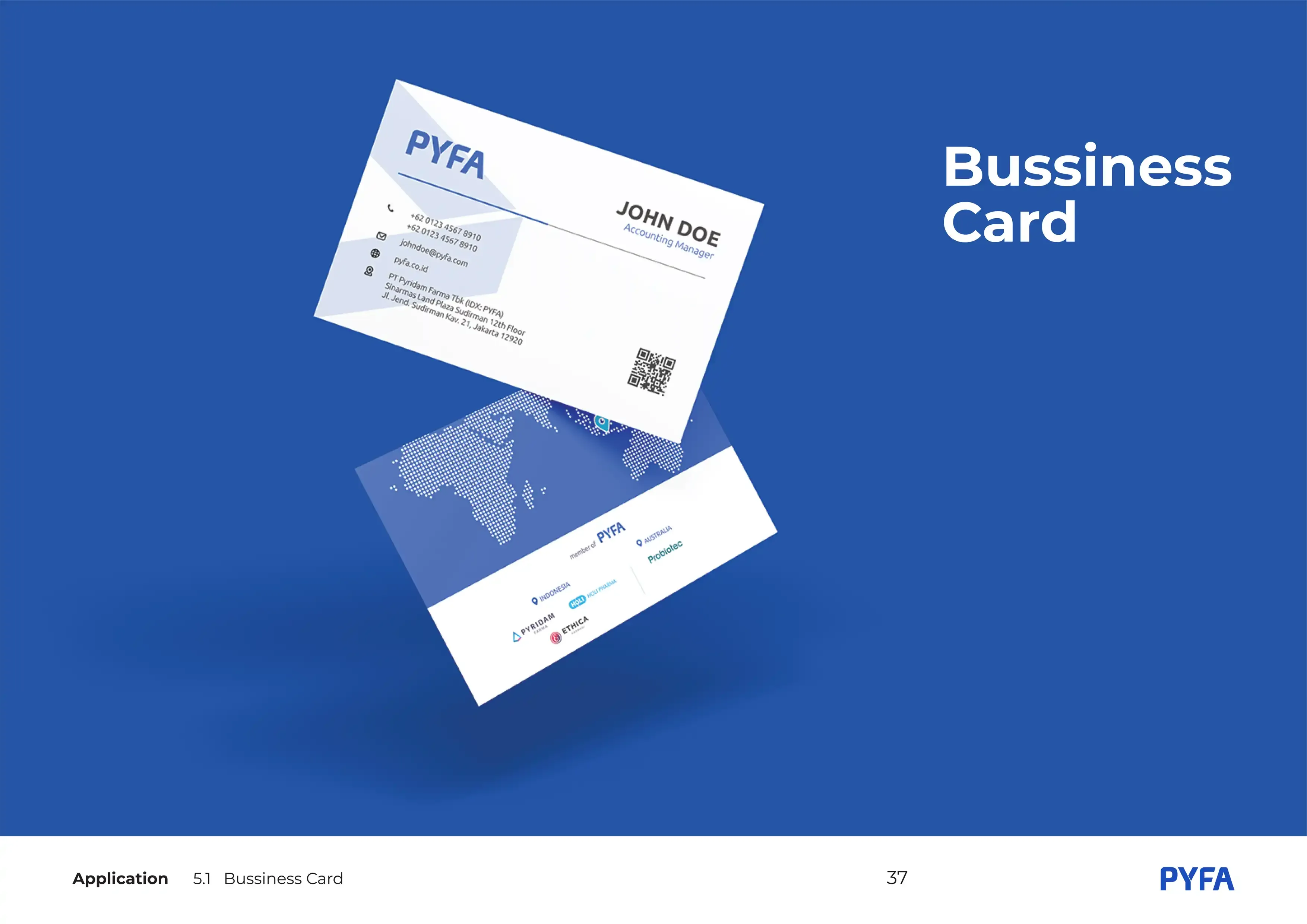
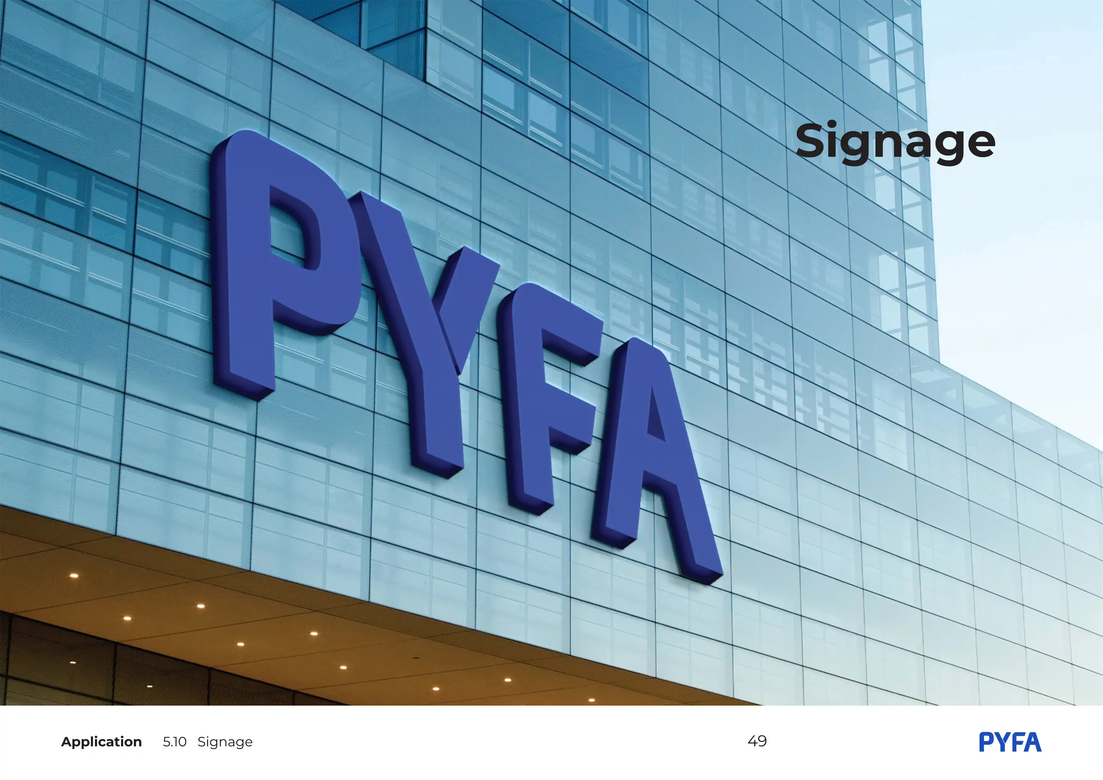
Application
The Outcome
The completed brand book provides PYFA Group with a clear, structured, and scalable identity system. It enhances internal alignment, strengthens professionalism, and ensures all sister companies communicate under one cohesive visual framework.
The result is a brand foundation built to grow with the organization for years to come.
